LS Logo
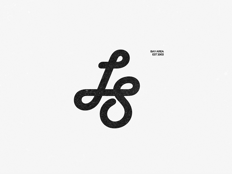
A smooth & simple logo variation
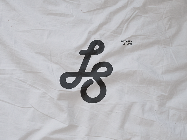
Exploring application on various textures, including linen and plastic*
I wonder if I should extend the tail of the S to mirror the tail on the L and become parallel with the line above it, it would look less like a recognizable S but would create more symmetry.
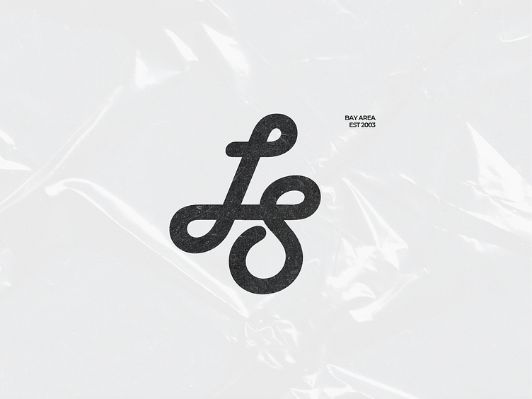
*no actual plastic was used in the making of this work, of course! It's just a mock up because plastic sucks!! but sometimes it does add a cool effect visually