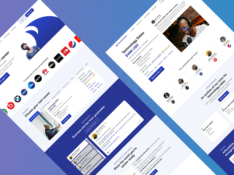
CourseCareers: UI Redesign
Overview
This was a redesign of a website platform for an existing company that I solely executed as an assessment.
Background
CourseCareers is an e-learning provider that trains students online in entry-level careers and helps connect them with entry-level positions and internships in the tech space, such as technology sales, information technology, software development, and more.
Scope
According to the Director of Product at CourseCareers, the company has been looking around to see what they can improve on their existing website in order to engage new users to sign up. Specifically, they wanted to focus on their home and technology sales (most popular course) pages.
Discovery
Without many contexts initially, I assessed both pages and hypothesized a few improvements/opportunities that should be addressed or considered for each:
Home
Data such as starting salary in the "Courses" section is nice but would be better to know where it came from, and the rating of competition seems vague
Reviews are great, but new users should be able to see them directly for themselves for transparency
There can be a video of an interaction between a coach and student (if possible) for authenticity in the "Coaches That Care" section
Technology Sales
There are redundant elements in the "Our graduates get hired" section that don't add significant value, such as certain text besides graduates' names and a card template that looks like an Instagram post
Under the "Career Overview" section, the day in the life should either show a video and/or a timeline of an alumni working in the field
Under the "Course Overview" section, there should be a video and bullet point summary of achievements of the instructor to quickly know who they are.
Stakeholder Insights
After sharing my suggestions/thoughts with the Director of Product, she agreed with my comments and decided to offer her insights of these 2 pages for me to absorb and approach a redesign with creative freedom:
Home
Brand direction should feel rebellious since CourseCareers is challenging the status quo in the e-learning space
Course pricing should be shown clearly for transparency
Users usually stop scrolling after seeing the third course since it takes a while to view each one
"Testimonials" section is important, but it doesn't appear to stand out much
Some users are indifferent to the "How It Works" section
"Certificate of Completion" section is also important, but could stand out more
"Coaches That Care" section doesn't mention other services; and there are videos of coaches and students, which is a shame to not show
"Our Commitment to Transparency" section adds no value
Technology Sales
Body text in the hero section seems to be alright for users, but could be shorter
Hero section doesn't look great with the testimonial card on the right
Users want to see company logos in the "Our graduates get hired" section
There's too much text in the "Why choose tech sales?" section and it doesn't really add much value
Users like seeing the course outline in the "Course Overview" section, but this could be more prominent
"Course Features" section appeals to users, but text seems a bit wordy
Design
Based on my discovery and key insights from the Director of Product, I redesigned both the home and technology sales pages with my design decisions, including color, font, icons, imagery, copywriting, branding, hierarchy, and layout. A few key changes include the following below:
Home
Courses are tabbed and shown one at a time for selectivity
"Coaching" section highlights services and shows coach/student videos
"Reviews" section allows users to see reviews directly from source links
Technology Sales
Cards of hired graduates are simplified with company logo added
"Career Overview" section has video and timestamps of a typical workday
"Features" section has cards rearranged in different layout with concise text


