MyStop App Redesign

Problem: The MyStop app is an app used by Penn State students and faculty, as well as State College residents to track and plan travel via bus. In it's current state is inefficient and outdated, and has garnered complaints from Penn State students/faculty and State College residents.
Concept: Create a more useful user experience by adding more personal features, including but not limited to:
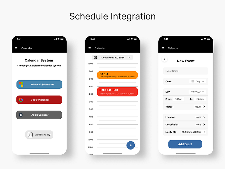
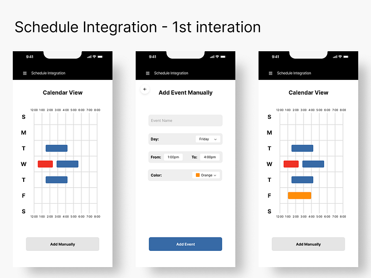
Integration with student/commuter schedules.
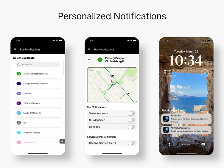
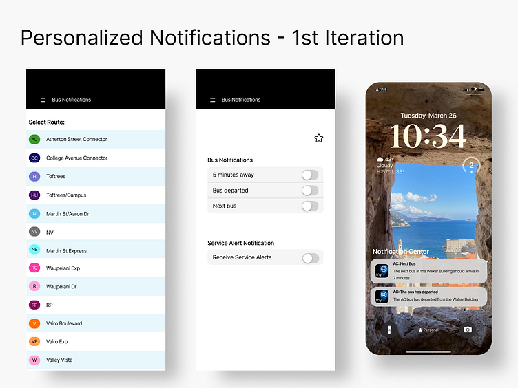
More personalization for bus reminders (i.e. notify me when this bus is 5 min away from this stop).
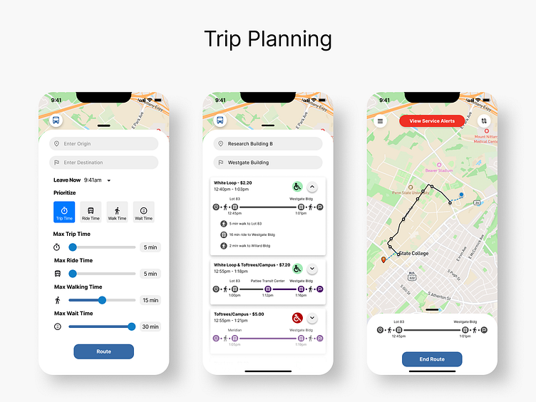
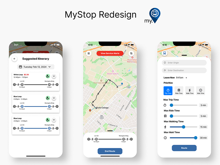
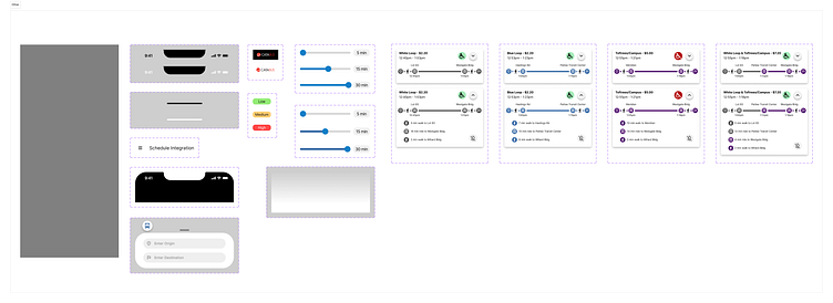
A trip planning section that does not rely so heavily on third parties (in it's current state, user is navigated away from the MyStop app and to Google Maps).
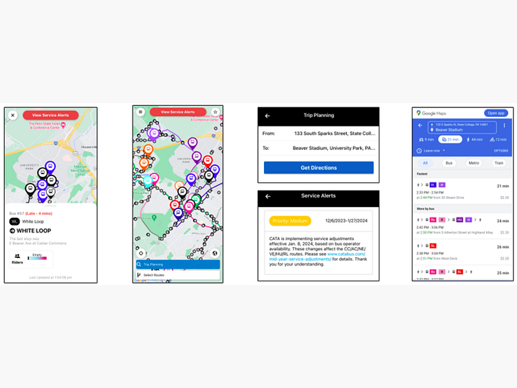
Old Design
Phase 1: Data Collection
For data collection, our team determined we would use competitor analysis, scenarios/use cases, and contextual inquiries using the MyStop app.
Competitor Analysis
RTD MyRide
Can plan a trip immediately and in the future, no third party necessary
Can plan trips with different modes of transportation
Transit
Allows you to track departure times, buses, and upcoming schedules
Has trip planning capabilities
Scenarios/Use Cases
Notifications: Sarah is a new freshman at Penn State and still has not developed a good schedule of getting to class. With her schedule already uploaded into the app, the application gives her a heads up for her busses. As she missed her first bus, she receives another notification letting her know another bus will be here shortly allowing her to catch the next bus.
Schedule: John frequently makes stops at the same building due to his class schedule. He hits chooses to import his class schedule through Google Calendar and can then view and choose the best travel route based on his schedule.
Contextual Inquiries
Some of our findings...
It is inefficient having to navigate between multiple apps to get directions.
There are no notifications for route delays currently.
Would be ideal for app to provide arrival and departure time of the bus.
Currently no push notifications, which there should be.
Should show multiple routes in case one does not work.
Service alerts and routes should somehow be combined.
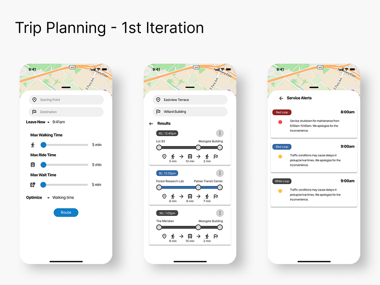
Phase 2: First Iteration of Prototype
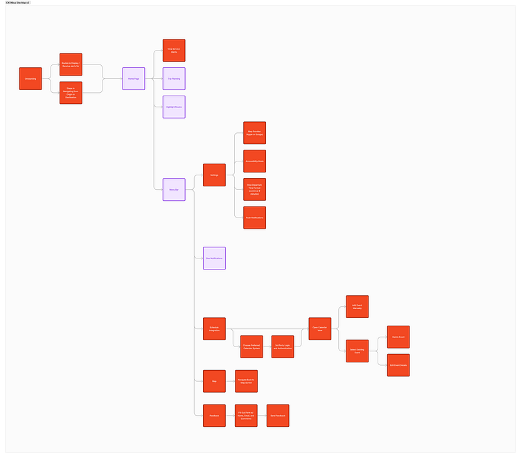
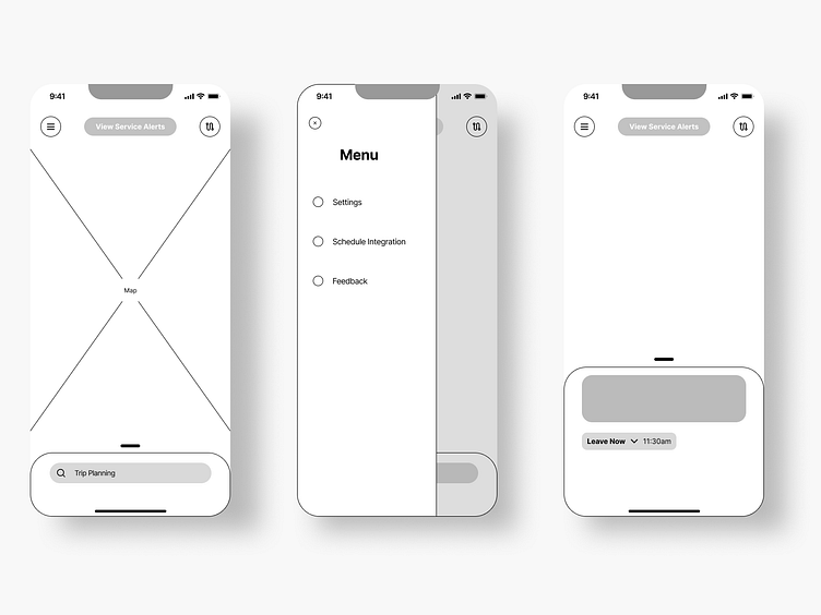
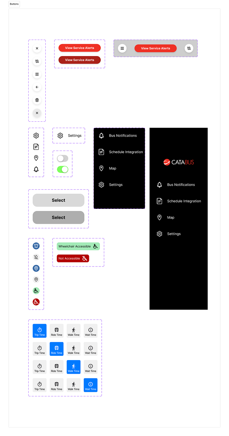
Before we began, we made a site map, wireframes, and components to outline what was needed for the design.
Then we began the first iteration.
Phase 3: Evaluation
For usability evaluation, we conducted 8 heuristic evaluations of the current prototype with students and commuters.
Our findings
Needs some kind of distinction for wheelchair accessibility.
Needs an indicator for free vs. paid buses.
Create a tutorial/onboarding process.
Tell user what stop they are closest to.
Route and itinerary buttons did not properly communicate their functionality for some.
Trip planning section is busy and needs to be reworked.
Rework notifications and view of commuter schedule
Phase 4: Final Design