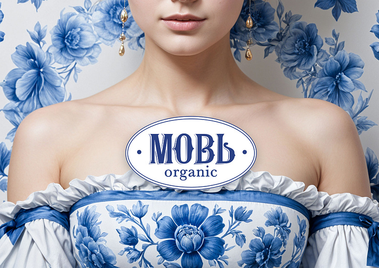
Packaging design for brand “Мовь»
LOGO
PACKAGING
DESIGN FOR
THE TM "МОВЬ”
The name "Мовь" translated from Old Russian, means "bath", or "sauna" - a symbol of tradition, self-care, and luxury.
Project goal: creating a brand of women's cosmetics that will transform into a line of bath products in the future.
Solution: turning to Old Russian styles and embodying them in the packaging design.
The design of the logo was based on the stylistics of Old Russian script, reflecting traditional cultural and heritage traits. The letterforms in the logo resemble patterns and ornaments typical of Old Russian style. The use of blue color in the logo and overall packaging style gives it an atmosphere of freshness, cleanliness, and tranquility, while also alluding to the imagery of deep Russian glazes characteristic of Gzhel painting.
The packaging design of "Mov" aims to evoke associations with Old Russian culture and traditions, emphasizing the luxury and care it represents. By incorporating elements of Old Russian style, the "Mov" brand promises not only aesthetic pleasure but also restoration and revitalization for the skin and body, as well as an authentic experience of beauty and care in the spirit of ancient Russian traditions.


