iHadis Website Redesign Homepage
As a designer, my goal was to enhance the visual hierarchy, improve information architecture, and create a more engaging and user-friendly experience for users while ensuring consistency with Islamic design principles. I've meticulously redesigned the homepage of the Hadith Website (ihadis.com) to achieve these objectives.
Weaknesses
Whwn i was looking this webiste homepage i feel like these are the weakness of this website homepage:
Lack of Visual Hierarchy
The homepage lacks a clear visual hierarchy, with all sections and elements appearing to have similar importance. This can make it difficult for users to prioritize information.
Limited Visual Appeal
The design of the homepage is somewhat basic and lacks visual appeal. Incorporating more visually engaging elements such as images or graphics could enhance user engagement.
Whitespace Management
There seems to be excessive whitespace on the homepage, particularly in the Search and footer sections. Optimizing whitespace could help improve the overall layout and presentation of content.
Heading Sections
The absence of bold headings throughout the website diminishes the clarity of information and weakens the overall visual hierarchy. Incorporating bold headings will help establish a clear structure and enhance readability for users.
Visual Consistency
There are inconsistencies in the visual elements used throughout the homepage, such as font sizes, colors, and spacing. Establishing a more cohesive visual style would enhance the overall user experience.
Redesign Process
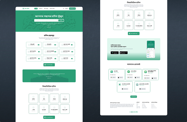
To improve the visual hierarchy, I made several adjustments. Firstly, I redesigned the logo to be more visually appealing and added it strategically to aid in content comprehension. Boldening the font for headings and making book names bolder enhances readability and draws attention to important information. I also added strokes to the Hadith book card section to emphasize its clickable nature and improve user interaction.
Information Architecture Improvement
Reducing the number of card categories streamlines the information architecture, making it easier for users to navigate and find relevant content. I also incorporated drop shadows to visually separate elements and provide a more appealing layout. In the footer, I minimized the number of items and provided clear labels for each section to improve accessibility and comprehension.
Engaging User Experience
To create a more engaging experience, I added an "Our Projects" section where users can explore Islamic projects and download them. This not only adds value to the website but also encourages user interaction and exploration. In the "Download App" section, I incorporated linear colors to evoke a sense of connection and appeal to the target audience.
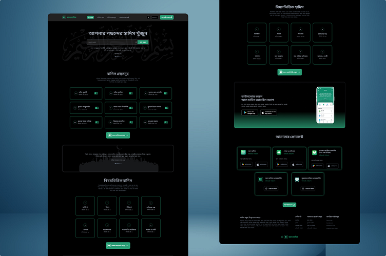
Consistency with Islamic Design Principles
Throughout the redesign, I ensured adherence to Islamic design principles. This included using appropriate colors, fonts, and imagery that resonate with Islamic aesthetics. The overall design reflects simplicity, elegance, and clarity, which are key principles in Islamic art and design.
Language Accessibility
Recognizing the diverse user base, I added a language dropdown section, allowing users to switch between English and Bangla languages for a more inclusive experience.
