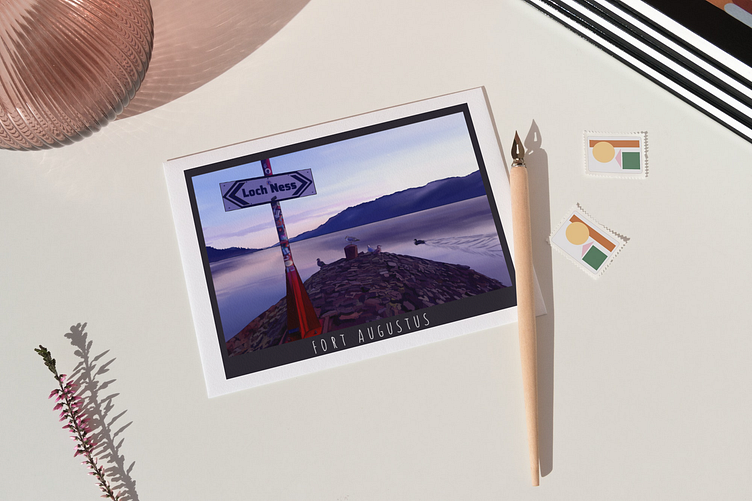
Post Card Design
The primary objective of this project was to design a postcard that captures the essence of the client's local area and would be available for purchase at the local gift shop. The client provided me with photographs showcasing the main landmarks of the location and requested that all of them should be incorporated into a single picture. Additionally, they wanted the village to exude a sense of tranquility and remoteness, while also enticing others to visit the place.
Drawing inspiration from these requirements, I employed the rule of thirds to create a visually appealing design. This composition guideline aims to achieve a more natural and balanced image. To draw the consumer's attention and evoke positive memories, I deliberately placed the Lake sign on the left side of the postcard. Furthermore, I included ducks and seagulls as symbols of the area's natural beauty and serenity.
The choice of a sans-serif handwritten font for the village name was intended to evoke nostalgic feelings, and color palette was carefully selected to convey a sense of peace throughout the entire illustration.
The objective of creating a captivating postcard that instantly entices consumers to purchase it as a gift or souvenir has been successfully met, as the design serves as an effective advertisement solution, showcasing the area's charm and attracting potential visitors.


