Kai Website_Homepage
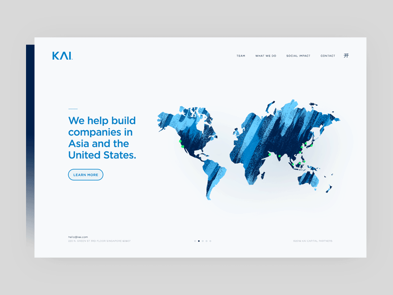
A sneak peek of a project that i did for my friend at KAI Capital.
My fav part is the Chinese Symbol"开", which is also the logo of KAI, is acting as the hamburger. And it totally make sense, since "开" in Chinese means OPEN.
And also the brushes created by @Kyle T. Webster is amazing when drawing the world map.