Semantic illustrations
From the illustration library I've made for Getnet. This company is a high-tech global payment platform that helps businesses accept payments securely while providing the best checkout experience for customers everywhere.
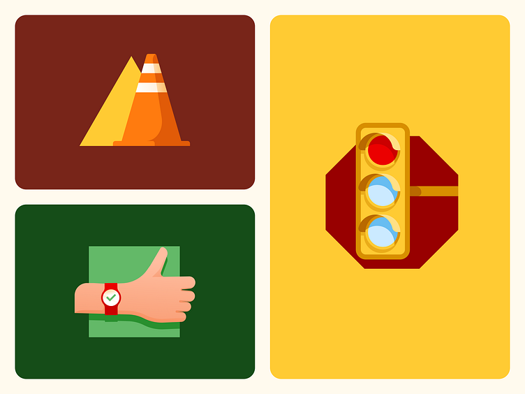
In this post I want to show you how I used semantics not only in the colors but also the shapes and elements of each illustration in the three main use cases.
The octagonal shape of the stop sign serves as a container for the traffic light with the red light.
A traffic cone represented in the shape of a triangle, a universal symbol of warning.
And for the ok signal, the classic thumbs up, reinforced in this case with the checkmark on the clock face, all on a square, along with the rectangle, a typical shape of informative signals.
When we illustrate for a digital product we must express a lot with few elements. On screens where the user is doing onboarding, performing an operation or any other task, it is important not to distract and be concise. This was a way to synthesize all that and reinforce the message we want to convey in each case.
Thanks!


