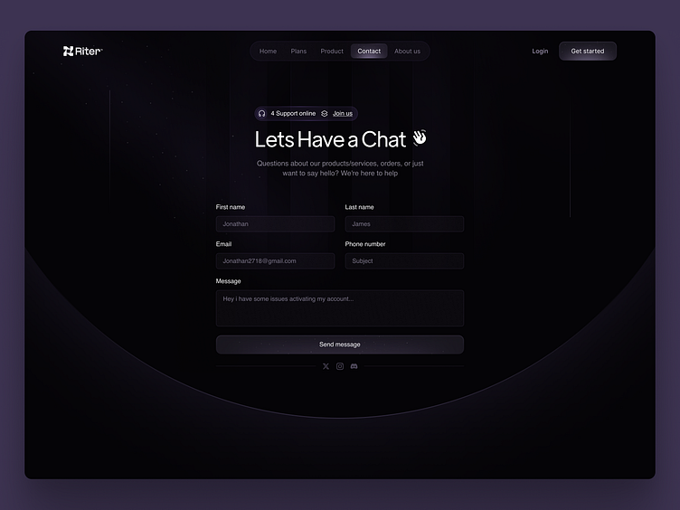
Contact Us Page
Chat with Us! A Clean & Functional Contact Us
Who says contact forms can't be fun? 🤩
This design injects a touch of personality into the contact experience, making it more engaging and enjoyable for users.
Simple and Sophisticated Contact Navigation
Button style 👇🏻
Responsive Design👇
This form interface utilizes a modern minimalist style with a clean, dark background and pops of purple for a friendly and approachable feel. The text throughout the design is white for readability.
Also the dominant purple color is a calming and professional choice, ideal for a tech company or a company that provides B2B services.
Thank you for your attention🙏🏻
Please consider liking the post if you liked it ❤️
✱
XOLAB ⚡️ 360 Design Agency
Hire us! xolabteam@gmail.com
More by XOLAB View profile
Like


