Family Connection Counselling
Family Connection Counselling is a private practice based in Fremantle, a small port town in Perth, the capital of Western Australia. They offer online counselling, EMDR therapy and supervision service for registered counsellor across the country. For this project, an opportunity has come up from our longstanding "connection" between the client and me. And together, we collaborated to create a logo and brand colour palette that embody the concept and philosophy of her new business.
The initial brief from the client was to create only a logo symbol that visually represent “connections” as ultimately that is what “counselling” can represent, and as what all individuals desire in deep in mind. To start, I began by sketching associated elements based on the concept, as well as referring to sketches provided by the client, and conducting research to select relevant keywords.
From the various ideas popped up during this process, including designs resembling mandalas representing the circle of life, designs evoking the embrace of nature, and collages of related elements, we narrowed down the appropriate designs and directions.
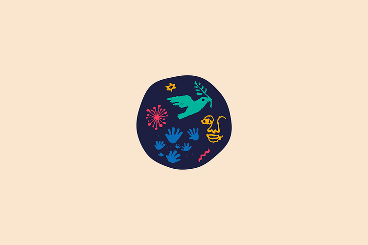
After some refinements, we reached the realisation that the logo deemed most suitable was one composed of the initial black and white sketches. The sketch - resembling a doodle naively drawn by kids, aligned well with the client's philosophy as a counsellor that we are all essentially just big kids trying to act like grown up. And the human mind is always unstable, elusive, and never in a perfect state. These human imperfection was accurately expressed through this doodle.
The elements incorporated into the logo, and their representation include: a flying bird representing peace and freedom, palms representing the human desire for connection and trust, a twinkle and spark representing the light of hope in darkness, a wave representing the ever-changing human mind, and a half face representing the persona of visitors. These elusive human conditions which appear randomly and fleetingly in the human mind, are scoop up within a circular shape with swaying edge representing the fluctuating mind, as if to making them more definitive—as the symbol of counselling.
The colour palette consists with colourful hues which resembling a rainbow, reflecting the psychology of color and art therapy used in counselling. Each colour represents various human emotions and is complemented with a human skin colour.
This logo has endured the passage of some years after the completion and is finally introduced to life alongside the fully ready business. Throughout this test of time, the client has been able to feel hopeful every time she saw it, which is one of the best and honourable feedback I have ever received. I hope this timeless logo will greatly contribute to the development of the businesses in the future.
The full project details on my portfolio website:
https://akaneyabushita.com/portfolios/family-connection-counselling/
-


