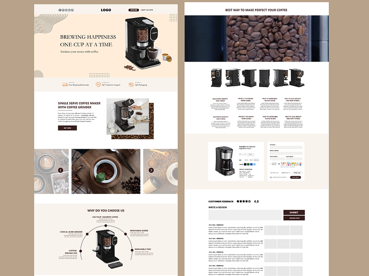
eCommerce Landing Page UI Design
E-commerce landing page UI design is all about creating a visually appealing and user-friendly interface that encourages visitors to explore products, make purchases, and engage with your brand. Here are some key elements and considerations for designing an effective e-commerce landing page UI:
1. Clear Value Proposition: Clearly communicate the unique selling points (USPs) of your products or services. Use compelling headlines, subheadings, and visuals to grab visitors' attention and convey the benefits of choosing your brand.
2. Responsive Design: Ensure that your landing page is responsive and optimized for various devices, including desktops, tablets, and smartphones. A seamless user experience across different screen sizes can significantly impact conversion rates.
3. Simple Navigation: Keep navigation simple and intuitive. Use a clean layout with easily identifiable menus, categories, and search functionality to help users find what they're looking for quickly.
4. High-Quality Imagery: Use high-resolution images and videos to showcase your products from different angles. Visuals play a crucial role in enticing visitors and conveying product details effectively.
5. Clear Call-to-Action (CTA): Place prominent and compelling CTAs strategically throughout the page. Use action-oriented language (e.g., "Shop Now," "Explore Products") to encourage visitors to take the desired actions, such as making a purchase or signing up for newsletters.
6. User-Friendly Forms: If your landing page includes forms for sign-ups, registrations, or purchases, keep them simple and easy to fill out. Minimize the number of fields required and use inline validation to reduce errors.
7. Social Proof and Reviews: Incorporate customer testimonials, ratings, and reviews to build trust and credibility. Highlight positive feedback and endorsements to reassure potential customers about the quality and reliability of your products or services.
8. Loading Speed Optimization: Optimize page loading speed by compressing images, minimizing scripts, and leveraging caching techniques. Faster loading times improve user experience and reduce bounce rates.
9. Visual Hierarchy: Use visual hierarchy principles to prioritize content elements based on their importance. Important information such as deals, promotions, or new arrivals should stand out prominently while maintaining a balanced layout.
10. A/B Testing and Optimization: Continuously test different design elements, CTAs, layouts, and content variations using A/B testing techniques. Analyze user behavior, engagement metrics, and conversion rates to identify areas for improvement and optimization.
By focusing on these key elements and best practices, you can create an e-commerce landing page UI that not only attracts visitors but also converts them into loyal customers.

