Frontier English Center
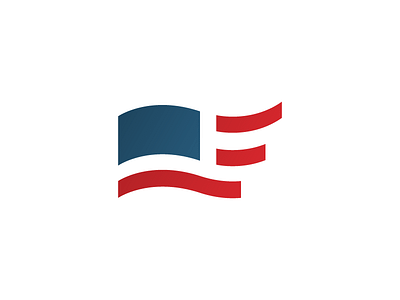
This was my first true shot at a symbol for a logo and my first real client, in my first year of design school almost four years ago. It's part of an identity for an english language course in south Brazil. You're supposed to see an F in the flag, and there's an E in the negative space as well. I still very much like the way this turned out.