ECUADOR | place branding | logo
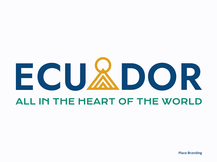
ECUADOR
place branding
The new identity of Ecuador aims to inspire people to experience Ecuador with a complete vision, to connect it with the world and the locals themselves, to communicate the territory's identity, and to generate distinction by highlighting its landscapes, cultures, traditions, and population.
Meaning & Inspiration
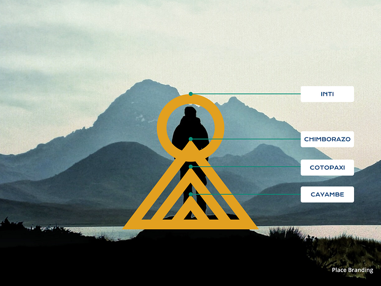
The logo draws inspiration from the rich tapestry of Ecuador's geography and ancient heritage. It symbolizes the country's distinctiveness as the land closest to the Sun, a fact that sets it apart from all other nations.The symbol of Inti, meaning 'sun' in Quechua, embodies the cultural significance of sunlight on the land and agriculture.Three triangles, embodying the majestic volcanic mountain range that spans the country. Each triangle represents the lofty peaks of Cayambe (5,790 m), Cotopaxi (5,897 m), and Chimborazo (6,263 m), symbolizing the courage and audacity of the people who inhabit these natural wonders.
Tagline
“All in the heart of the world”
Inspired by its central location and the rhythmic beat of its volcanic peaks and snow-capped mountains spanning 350 kilometers, Ecuador reveals itself as the pulsating heart of our planet.
______
Explore the full project on Behance
