Ntek - Visual Identity
Helping Ntek take advantage of the online space with a brand new visual identity.
Ntek is a retail shopping store for high-quality electronics and commercial catering equipment.
My goal was to present N-tek as a quality, trustworthy, and professional brand while maintaining its familiar and dedicated approach to delivering quality products and a great customer experience.
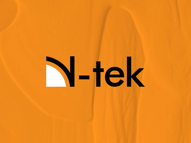
The new N-tek logo, which is a wordmark, feels welcoming and approachable. I wanted to celebrate the founder's name as he is fondly called and well known with 'Nonye' hence the emphasis on the 'N' which can be used as a standalone for the brand logo mark.
The design direction takes on a minimal and modern look with technological vibes which have the potential of staying with the brand for a long long while through any expansion.
The choice of colour here depicts the Brand's Values of quality and sophistication yet affordable for their varied customer base.
Check out full case study @ https://oniontabs.com/impacts/ntek


