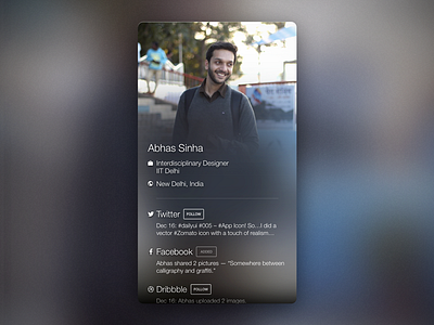
Daily UI 006: User Profile
Day 6!
Okay — biggest realization so far — thinking of what to make a concept for takes way more time than thinking of what concept to make.
I looked back to something that I was looking for a few days ago — a way to exchange business/visiting cards digitally.
I recently met with a person who was starting up a company. Unfortunately, he didn't have any business cards left with him. Of course, he could've shared a link to his Facebook or LinkedIn profile, but I thought it would be great to have digital business cards — completely up to date with one's social media profiles (depending on what the user chooses to share on his/her card). The idea is that the card owner can constantly update his profile/links, and they'll change for all the people that have that card saved.
So here's a concept digital business-social card meant for a wallet-like app that stores cards like a…rolodex.
--
The way to ascertain that this layout will work with all sorts of images is that it's a solid dark gray background if the user supplies no image. If they do, then they get to crop and choose what to see in the upper half. The same image is then flipped vertically, scaled, and blurred. On top of that, a gradient fades to black towards the bottom to maintain legibility of white text.
--
As always, I would love to hear your thoughts on this! :)
Side note: Yes, that's me :P
