GROWCES
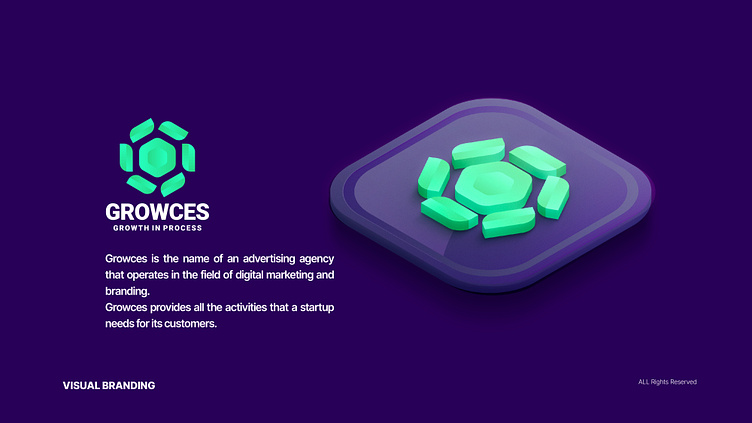
GROWCES is a digital marketing and branding agency that aims to help its clients grow their brands and business. The company's logo communicates its goals and services to the target audiences. The name GROWCES is a combination of two words, "Grow" and "Process," which are indicative of the agency's activities.
The logo uses two symbols, the sun, and a flower, to depict power, influence, and growth. The sun symbol represents energy and signifies the breadth of services and impact of GROWCES in the digital marketing and branding field. The flower symbolizes development and growth along a dynamic path. The hexagonal geometric shape in the logo represents precise organization and mathematical calculations for the target audiences.
The logo's color is green, symbolizing wisdom, knowledge, and positive ideas. It is combined with purple to add energy and balance to the design, evoking beauty and inspiration. The sans-serif font in the logo presents a simple, clean, and modern appearance, aligning well with the digital advertising and branding objectives.


