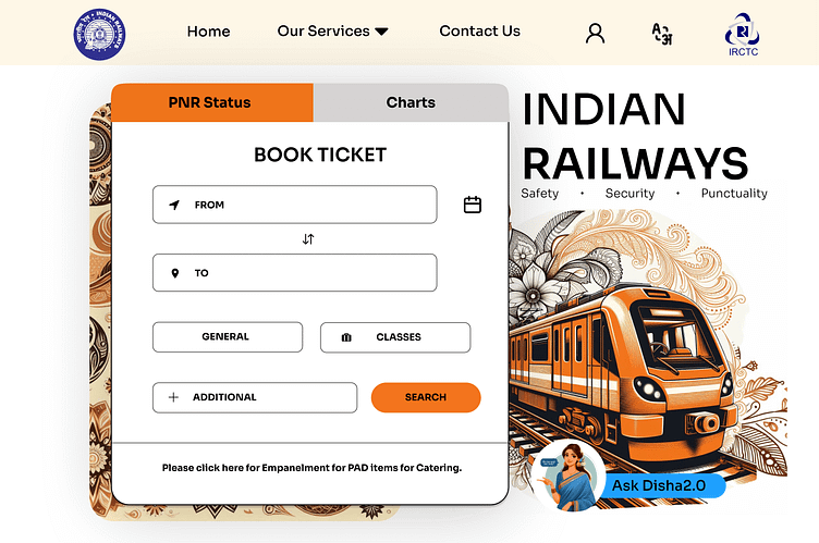
Re-Design work for IRCTC Landing Page
🚄Rework: IRCTC Website
This design has been sitting in my drafts for a while, but I felt like sharing it with all of you. I initially created this rework design as part of my application for an internship opportunity at a company. Unfortunately, that didn't work out 😅, so I moved on to my next project as usual. But this morning, while clearing up some folder space, I came across this design again and felt it deserved some appreciation—first and foremost, from myself 😂. I designed this purely based on my intuitive thoughts, without any prior experience or knowledge in UI design. So yeah, here’s the design and hope y'all like it.
Key Features of My Design:
✅ Simplified Navigation: Services like buses, flights, and hotels are hidden under a dropdown menu, making navigation more straightforward and enhancing user interaction and understanding.
✅ Enhanced Focus on Key Elements: The light-colored background highlights the navbar components more effectively, while the minimal background design ensures the form component receives full attention.
✅ User-Friendly Form Design: The booking form is simple and intuitive, making it easy for users to input the correct data. Additional data fields are grouped under a single component, keeping the form clear and easily understandable.
✅ Sleek Chatbot: The chatbot is placed prominently in a separate color, clearly indicating its availability for assistance.
✅ Improved Visual Quality: The overall design features high-quality images and graphics, avoiding low-quality visuals that can detract from the user experience.
Notes :
My Draft notes which I took while designing, mentions about the pros in my design and the cons in the old design of the irctc website... 👇
If you feel this design is Good , Motivate me with a Like 👍.
───── ⋆⋅☆⋅⋆ ─────
📩 For contacts :
Email: madhannmady@gmail.com
LinkedIn: Madhan kumar K
© Madhan kumar K


