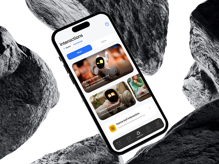
Loona Robot App
☝️
Loona app redesign: enhancing interaction
and usability
The main objective of the redesign is to simplify the user's interaction with the Loona robot. To make navigation clearer and to bring the main elements of interactive interaction with Loona to a higher level. The new home screen design allows you to connect to Loona with a single button, go to the Loona conversation section and change basic connection settings.
The user profile and Loona'sprofile are combined intoone section
This allows you to quickly configure your Loona robot pet, view messages, user guide and view reward statistics for various Loona activities. All sub-sections of the settings are divided using tabs. This simplifies the user's perception of the information. Added functionality for user rating, their comments in the community and posts available to other members of the Loona robot community.
The entire setup functionality for the Loona robot contains hints and is divided into steps. In this way the user will not get confused by the large number of settings. All settings for your Loona robot pet in one section. Animated illustrations have been added to all of the robot's settings blocks to show you what to do.


