Event App for Architects
The effect of a quick UI challenge with my colleagues.
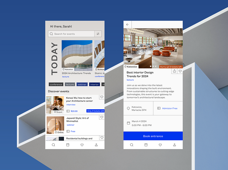
The first screen is the main screen of the app, where, besides a search bar with filters, the user sees highlighted events happening today (or soon). There are also options for quick filters, and below that, a list of events that might interest them. The bottom navbar, besides a favorites list, a search function, and profile settings, also includes a tool for conveniently searching for suitable dates through a calendar feature.
The second screen presents the event view, where we provide the user with key information (date, time, location, event price). To motivate participation in the event I decided to add notification badge and make the bright CTA button sticky to the bottom.
I wanted it to have a technical drawing vibe, as if someone drew the layout on paper using a pencil and a ruler. I opted for juicy CTA color that contrasts with warm orangish accents.
Pics source: Behance.net
Font: Founders Grotesk
