Horner Painting 25th Anniversary Branding
With over 25 years of experience, Horner Painting has established itself as the leading painting company in Northern Colorado. Their goal is to communicate with every customer with clear communication, exceptional customer service, and a standard of excellence in residential painting, which sets them apart from the competition.
Goals
Horner Painting came to us asking for three components—a special badge for the 25th anniversary, a refresh of the current logo, and a comprehensive redesign of the official website. The objective was clear: to craft an identity that resonates with Horner Painting's target audience, ensuring the visuals and user experience of the website communicate the company's commitment to quality and attention to detail, which has earned them respect in the Fort Collins, Colorado community.
Brand Strategy Development
Engaging in an in-depth brand strategy session with Horner Painting was pivotal in gaining a deeper understanding of their ideal customer's motivations and needs. GDCO explored the distinctive elements that would attract customers to Horner Painting and how best to integrate them into the brand's value proposition. This exercise became the foundational stone for all subsequent design decisions.
Anniversary Badge Design
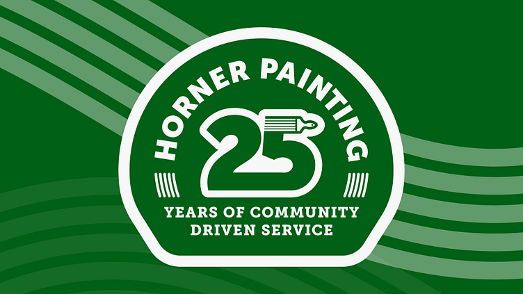
The creation of Horner Painting's 25th-anniversary badge was approached with a retro-inspired mindset. The aim was to reaffirm and honor the existing legacy while appealing to the tastes of modern customers. The badge needed vintage charm without compromising the brand's contemporary relevance.
Primary Logo Refresh
The logo refresh required each element to be evaluated and refined. The paintbrush logo was redesigned to balance its original brand recognition with an upgraded, modern feel. A contemporary color palette was selected to mirror the refined preferences of Horner Painting's clientele, coupled with a font that exudes the company's synonymous quality and craftsmanship. Due to the wide range of uses of the logo, we needed to create a scalable set of logos to ensure that it would be crystal clear and legible no matter where the logo was to be seen.
Website Redesign
With the ideal customer profile as the North Star, the website received a total transformation that was engaging and strategically aimed to convert visitors and make it easy to navigate. The new web copy spoke directly to the target audience, the color scheme was harmonized with the updated brand palette, and the portfolio imagery underwent strategic selection to showcase Horner Painting’s expertise.
Continuity was maintained by integrating unifying brand patterns, color palettes, and tone of voice, and every touchpoint on the site was designed to lead to a clear call to action. Additionally, the entire website became fully ADA-compliant and mobile-friendly, enhancing accessibility and user experience across devices.


