Courtney's Corner Brand Identity
Courtney's Corner is a Nashville Tennessee-based non-profit that provides year-round programming for individuals with special needs. They utilize music, drama, and movement to facilitate communication, improve social skills, encourage healthy self-expression and promote personal growth.
The Courtney's Corner team reflects who they serve beautifully; they are a joyous, vibrant, and loving. There is no group of people quite like the special needs community. No one can rival their acceptance and love. You don't need to earn their love; it is given immediately and unconditionally. Full-life joy overflows from their hearts. If only all people could be like this.
How do you make a logo that captures that joy?
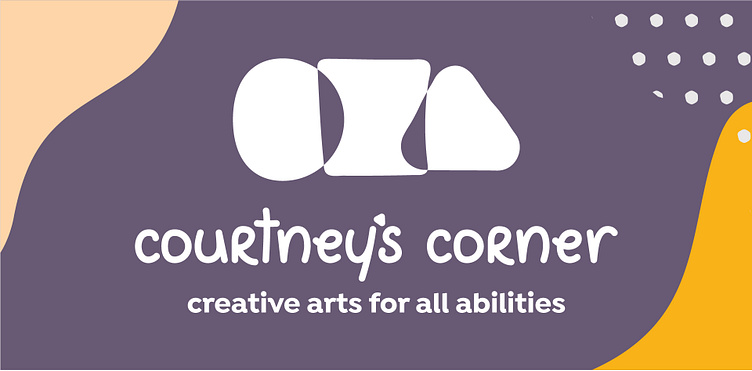
Circle. Square. Triangle. The three shapes blending into one symbolizes inclusion. The arts are for everyone. At Courtney's Corner, They strive to create a program where everyone belongs, no matter their ability.
The shapes, patterns, and colors are hand-drawn, organic, and vibrant. It was vital that you immediately feel the energy from seeing their logo and branding. After all, you are immersed in their energy when you spend 5 seconds in a group of individuals with special needs. They are vibrant, fun, and genuinely creative.
One of our favorite parts of the new look is the fun hand-drawn font. The font is adapted from Courtney Queen's handwriting from old letters that she wrote Kelsey, the founder of Courtney's Corner.
Our goal was to showcase how amazing individuals with special needs are with their branding and visuals. We are excited to help bring their stories and the power of inclusion to as many people as possible.


