"SignSync: Bridging the Gap Between Sign and Speech" - UI Design
🚀 Dive into the vibrant world of SignSync, a groundbreaking web application crafted to bridge the communication gap for the deaf and hard-of-hearing community! This UI concept unfolds a seamless blend of technology and design, featuring a clean, intuitive interface that makes real-time sign language detection both accessible and engaging. From the vividly welcoming landing page to the sleek session dashboards, each screen is meticulously designed with user experience at the forefront. Explore the fusion of bold color schemes, dynamic typography, and user-centric navigation that brings the world of sign language to your fingertips. Join us in celebrating inclusivity through design!
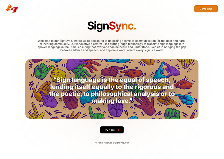
Welcome to the entry point of SignSync, where vivid colors meet functional design! The landing page sets the stage with a powerful tagline and an inviting illustration that celebrates sign language. Our use of vibrant, energetic colors aims to evoke positivity and inclusivity, while the ‘Try it out’ button is strategically placed for immediate engagement. This page isn’t just about aesthetics; it's structured to provide quick insights into what SignSync offers, ensuring that new visitors can grasp the value of the application at a glance.
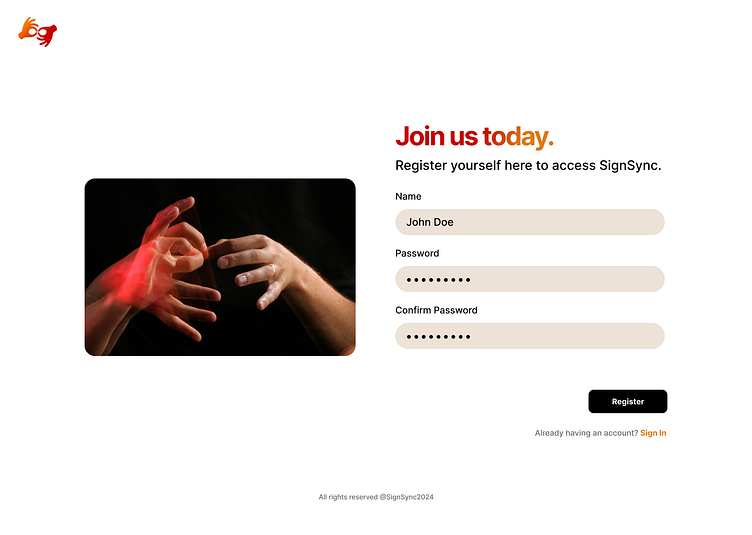
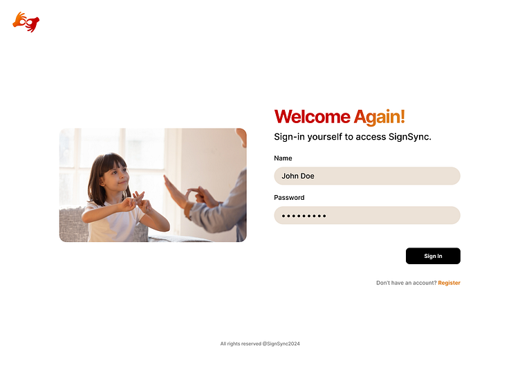
Security meets style in our login and registration interfaces. These screens are designed with simplicity and ease of use in mind, ensuring that users can access their accounts effortlessly. The minimalist approach reduces visual clutter, focusing the user's attention on the essential fields. This streamlined process not only enhances user experience but also strengthens accessibility, featuring large, easy-to-read fonts and high contrast elements that aid visibility for all users.
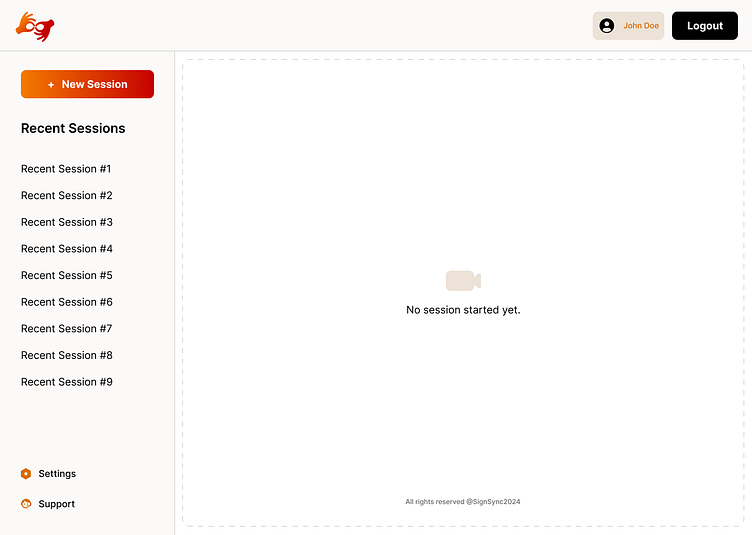
In scenarios where no sessions are active, the dashboard remains engaging. This design choice ensures that the user feels organized and in control, with clear, direct prompts to start a new session. The layout remains consistent with the rest of the app, providing a sense of familiarity and stability. The use of empty states is optimized to guide users towards productive actions, maintaining engagement even in the absence of active sessions.
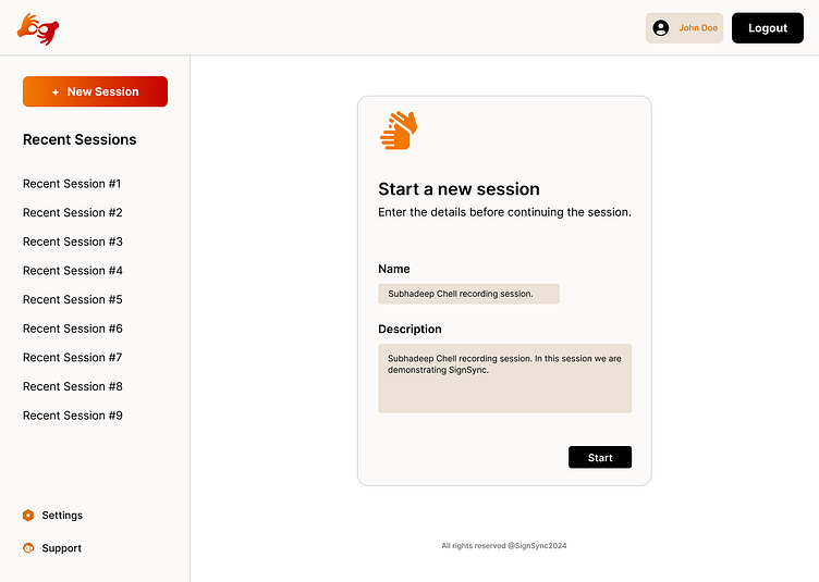
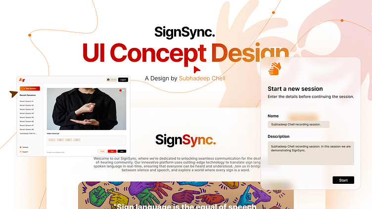
The dashboard is where users interact most with SignSync, and our design ensures this experience is smooth and intuitive. When starting a new session, users are greeted with a clean layout that guides them through session setup without overwhelming them with options. The interface uses a soft, neutral color palette to encourage focus, with orange accents providing just the right amount of energy and visual guidance. Each element is placed to ensure logical flow and ease of use, enhancing the overall user experience.
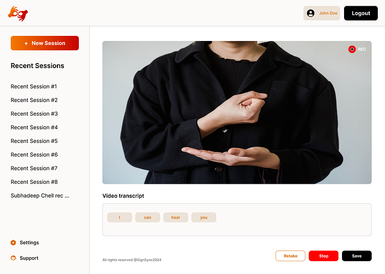
Our video session interface is where the magic happens. Designed for real-time communication, this screen features a minimalistic layout that maximizes workspace without sacrificing functionality. The video feed is prominently displayed with transcription tools and session controls intuitively placed for easy access. The UI is designed to be distraction-free, allowing users to focus on communication. Interactive elements like the transcript editing options are designed with accessibility in mind, ensuring that every user can navigate the session effortlessly.
Each of these designs is crafted not just for visual appeal but to enhance the usability and accessibility of SignSync, making it a powerful tool for its users.
I’m on a mission to create digital experiences that resonate and redefine boundaries. Let's connect and transform the digital realm together! 🤝
I'd love to hear your thoughts, critiques, and ideas! Drop a comment, leave a like, or hit me up for collaborations at : sherlockx90@gmail.com ! 💌
Let’s make digital experiences that stand the test of time and technology. Ready to ride the wave of innovation with me? 🏄♂️
Thank you. Made with ❤️ by Subhadeep Chell.
#UIDesign #UXDesign #DigitalInnovation #UserExperience #CreativeCoding #DesignThinking
