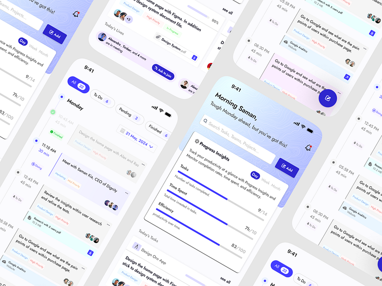
Task Management App UI
Hey Dribbblers,
Here is some screens of a task managing app which I;ve been working on for 2 weeks.
Design Choices & Solutions:
Unified Dashboard: The dashboard integrates various functionalities like task lists, calendar views, and progress tracking in one clean interface. This design choice helps in minimizing navigation and allows users to access everything they need from a single screen.
Color-Coded Task Prioritization: Tasks are color-coded based on priority and status, making it visually intuitive to distinguish between different levels of urgency and completeness. This visual hierarchy aids in quick decision-making and ensures that high-priority tasks are easily noticeable.
Progress Insights: The integration of a 'Progress Insights' bar at the top of the main dashboard offers users a quick snapshot of their productivity trends. This feature is designed to motivate users by showing tangible progress and efficiency levels, encouraging them to maintain or increase their productivity.
Interactive Elements: Interactive elements like swipe actions for task completion and voice memos enhance user engagement and provide flexible ways to manage tasks. These features are particularly useful for users on-the-go, making task management more dynamic and accessible.
Personalized Greetings and Suggestions: The app includes AI-driven personalized greetings and task suggestions based on the user's historical data and work habits. This adds a layer of personal touch and makes the task management experience more tailored and effective.
Scalable Design: The layout and elements are designed to ensure scalability, supporting different types of users—from individuals managing daily tasks to teams collaborating on large projects. The flexibility and scalability of the design make it a versatile tool for various contexts.
👋NEED HELP ON A PROJECT? LET'S TALK
