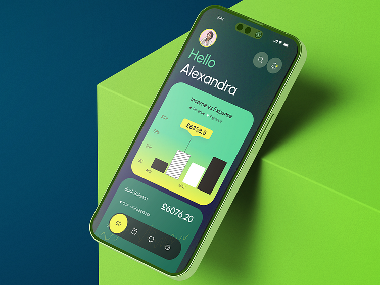
Bank wallet screen design
I got commissioned to design a mobile app screen for a digital banking app. This case study will discuss the challenges, design details,details, and results of the project.
The client and I discussed the project over a free consultation.
Challenge: Design a user-friendly bank wallet app that balances functionality, aesthetics, and a unique user experience.
Target Audience: Tech-savvy digital banking users.
Design Solutions
User Experience: The app is easy to use, with information arranged in a hierarchy and familiar icons used for features.
Personalisation: The app opens with personalised welcome greetings for every user with their profile picture and name.
Data Visualisation: The income vs.vs. expense data is represented with bar charts. It’s simple yet effective.
Modern, minimalist design: clean lines and the and the use of white space create a stunning and functional interface.
Result
The final design achieves every goal it was created for. It’s functional, user-friendly, and user-friendly, and clean design is going to provide an excellent web experience. The client also shared positive remarks after receiving the deliverables. It is everything and more than what they hoped for.
Hire a professional mobile app UI/UX designer.
Book a meeting.


