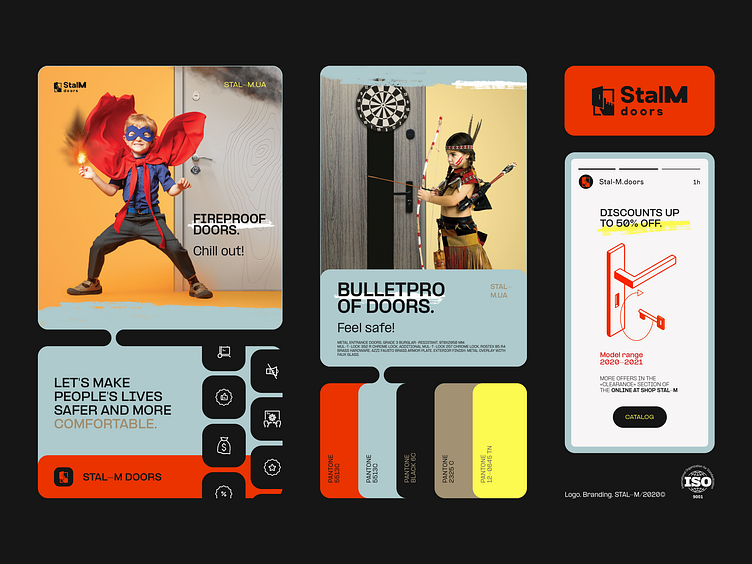
Logo. Branding. StalM doors
Hello Everyone!
As the designer spearheading this project, I am excited to unveil the comprehensive branding package developed for Stal-M. Our collaboration extended across logo design, brand identity, and advertising materials, where we embraced a daring approach by introducing a non-traditional Pantone color palette. These hues were carefully selected to embody the company's philosophy of enhancing people's lives by making them safer and more comfortable.
PANTONE 12-0645 TN exudes warmth and vitality, symbolizing optimism and renewal. Pantone 2325 C represents trust and reliability, reflecting the company's commitment to providing security. Pantone Black 6C conveys sophistication and timelessness, while Pantone 5513C embodies tranquility and serenity, fostering a sense of calm and assurance. The repetition of Pantone 5513C reinforces the idea of harmony and balance within the brand's offerings.
The logo mark, meticulously crafted, comprises three distinctive graphic elements, each infused with profound philosophy and symbolism. The doors epitomize the concept of freedom and passage, with open doors evoking the welcoming embrace of hospitable hosts. The hand symbolizes protection, offering a sense of security and reassurance to customers. Meanwhile, the rectangular shape mirrors the door frame, evoking notions of boundaries and safety.
This conceptual framework extends to both the Symbol (or Mark) and the typographic component of the logo. Our choice of a geometric grotesque font aligns seamlessly with the brand's identity, boasting geometric precision, symmetrical elegance, steadfast stability, and optimal readability.
Thank you🤗
⭐️ ⭐️ ⭐️
Projects 📩
Let's Connect 👋
