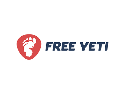
Free Yeti Redesign
Hi everyone, here a rebranding process I've been a part of. Free Yeti is a ski, snowboard and accessories online shop based in Romania. They needed to refresh their identity as the market started to become crowded and they were starting to loose awareness. I won't enter into the brand strategy details here and stick only to the logo design matters. Since the name and their symbol has a great potential we continued on the same idea with the design, refining it and add another subtle element - a shield-like shape where the footprint will be put on. When drawing different versions of footprint I selected this more humanoid version. The bold type was custom built and the slanted when vectoring to speak about the dynamics of these winter sports.
Long comment there, hope you guys like it, have a great day ;) Feedback appreciated like always.

