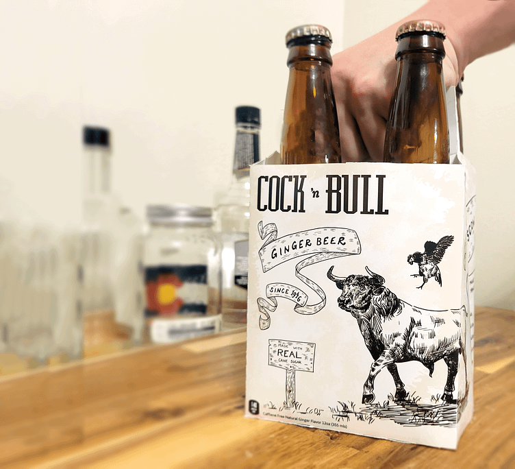
Cock n' Bull Packaging
Cock n’ Bull Ginger Beer packaging was redesigned including the four bottle drink carrier and bottle labels. Cock n’ Bull, known as the creator of the Moscow Mule, prides themselves on their history and originality. Original “Cock n’ Bull” wordmark logo was maintained throughout the redesign. Textures and fine line illustrations were chosen to align with the vintage and antique identity of Cock n’ Bull. Text on the front of the packaging was hand-lettered to further encourage the nature of Cock n’ Bull’s branding. Hatching and cross-hatching was used to add dimension and texture to the illustrations while paying homage to old line drawings and sketching techniques.
More by Kara Farmer View profile
Like


