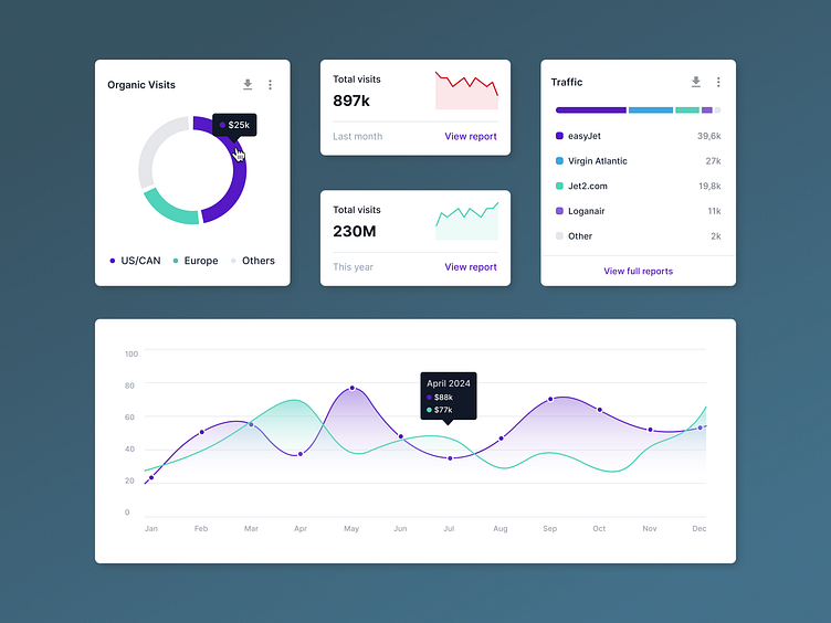
Coming up... data viz!
The goal
To create some sleek, clean and modern-looking UI components for different types of data visualization sections within our client's Martech platform.
The challenge
Our client is strongly positioned in the world of analytics in SaaS already, so the challenge laid mostly in giving their current UI a 2024 facelift, bringing their look and feel closer to the current popular trends of using components that are minimalists but packed with lots of valuable data. Plus, they were using up until this point their marketing-oriented brand colours, which as a user interface could be a little too jarring on the eye. Great for an eye-catching landing page, not so great for every day use.
The outcome
Based on their brand colours, we refined a UI palette that we thought is quite fitting for analytics and data viz - the high contrast combination of the purple and teal, not too saturated and bright, but definitely not dull... Although we only see a couple floating components here, we can foresee that a fully fledged product with many pages worth of these following this palette would be quite nice and engaging to use regularly.
Work with us
UserActive is a product design agency specialising in B2B SaaS. We’re on a mission to help SaaS Founders create meaningful products that users love.
Book a call 👉🏼 www.useractive.io
