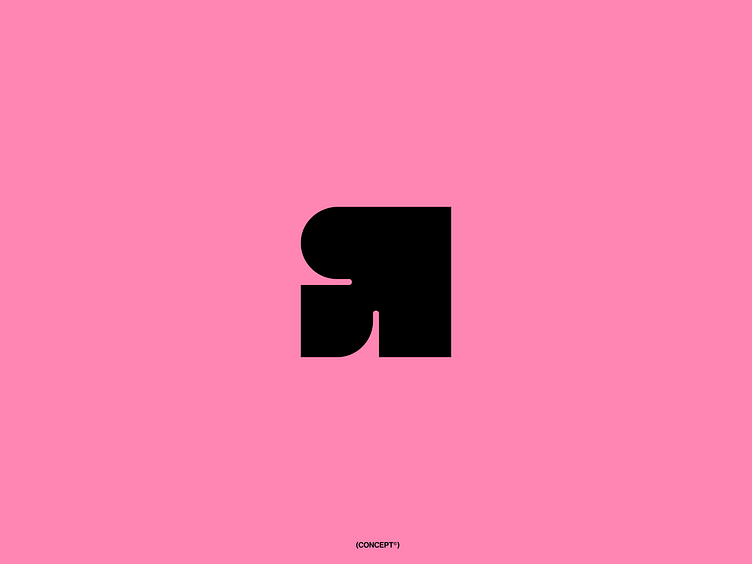
Mirrored 'R' + arrow up mark
Unused concept for a company that focuses on recycling diapers.
The logo consists of a mirrored letter 'R' (the first letter of the company name), an upward arrow (representing continuous innovation), and melting elements (symbolizing the separation of different substances in the recycling process).
©All rights to this work are owned
by Mandelo Digital Branding Agency.
More by Matthijs Zoet | Brand designer View profile
Like

