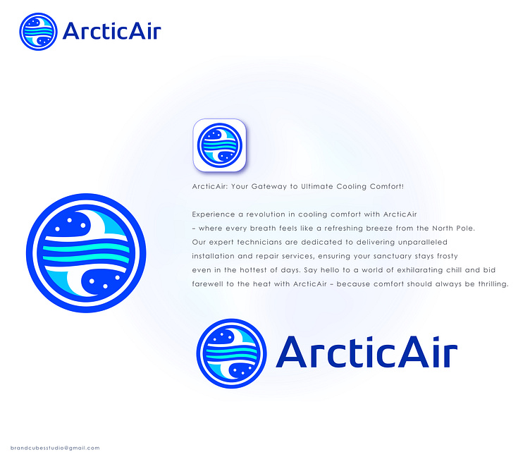
ArcticAir logo
Imagine a crisp, cool breeze swirling within a perfect circle. This dynamic image, formed in various shades of blue, is the ArcticAir logo. The blues transition seamlessly, mimicking the icy depths of a glacier and the refreshing coolness of a summer sky. This swirling current isn't just visually appealing, it represents the very essence of ArcticAir's service - delivering a blast of cool air directly to you.
Complete climate control: The circle itself holds a deeper meaning. It symbolizes the wholeness of ArcticAir's services. They're not just here to install your air conditioner; they're here to ensure optimal climate control in your home. Whether it's a brand new unit or a repair, the circle signifies their commitment to seeing the job through, keeping your environment perfectly chilled.
Memorable and Modern: The logo's simplicity and clean lines make it instantly recognizable. The blues and the swirling cool air create a contemporary feel, perfectly reflecting a company that prioritizes both cutting-edge technology and customer comfort. The ArcticAir logo isn't just an image - it's a promise of cool, refreshing air delivered with expertise and care.
Looking for the gateway to chillness? LIKE ❤️and follow me for ArcticAir wonders – where our logo isn't just a circle, it's a portal to a frosty wonderland! ❄️🌀 #CoolnessUnleashed ✨
Ready to give your brand the chill treatment? 🌀 Shoot me an email at brandcubesstudio@gmail.com, and let's craft a logo that's as cool as the ArcticAir breeze! ❄️✉️ #ChillLogoCrafters ✨
