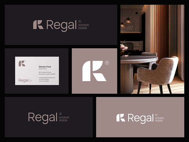
Regal Interior design brand identity | R letter logo
Introduction:
Regal Interior Design, a brand synonymous with luxury and style, sought to refresh its image while staying true to its essence. The challenge was to infuse innovation, modernity, and elegance into its brand identity without losing the core values that define it.
Logo Design:
The focal point of the rebranding effort was the creation of a dynamic logomark. By ingeniously combining three geometric shapes, each representing an aspect of Regal Interior Design’s ethos, the R letter emerges. This not only reflects the company's initials but also symbolizes unity, harmony, and balance—the cornerstones of its design philosophy.
Print Materials:
Every touchpoint was carefully considered in the rebranding process. From business cards to letterheads, envelopes to posters, and billboards, each material reflects the brand's commitment to innovation and elegance.
Social Media Presence:
In today's digital age, a strong social media presence is indispensable. To this end, custom post templates were designed to maintain consistency across all platforms while showcasing the brand's innovative designs and projects. Striking visuals coupled with engaging copy create an immersive experience, inviting followers into the world of Regal Interior Design.
Conclusion:
Innovation, modernity, and elegance are at the heart of Regal Interior Design's rebranding journey. By seamlessly integrating these elements into its logo, brand identity, print materials, and social media presence, the brand has reaffirmed its commitment to excellence while embracing the evolving tastes of its audience.
Client: Regal Interior Design | Service: Logo & Visual Identity
For inquiries:
Mail: jubayergd60@gmail.com, Whatsapp: +8801797623803


