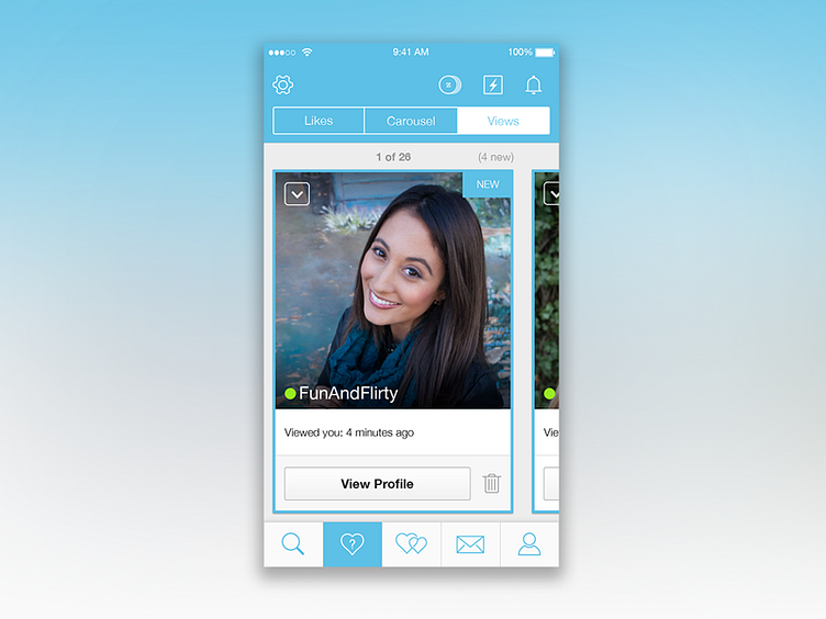
Zoosk Simplified Nav
It's been a while since my last Dribbble post, but many exciting things have been happening.
This is a redesign of the Zoosk iOS app that I spearheaded. The goal was to simplify the navigation, condense experiences, and unify all pages into a consistent and cohesive experience.
It was one of the biggest projects I've worked on to date, and I'm happy with the end result.
I'm now well into another design project, which will be huge. So can't wait to post more about that in the coming months. Stay tuned!
More by Danielle Chandler View profile
Like
