SHAKE THAT CHICK | LOGO DESIGN & BRAND IDENTITY
Shake That Chick [Logo and Branding Project]
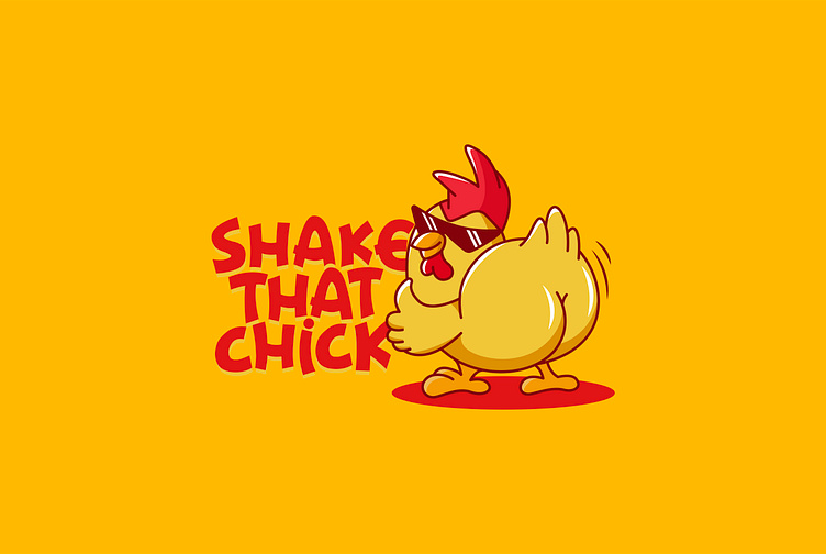
Shake That Chick fast food brand with a fun and humorous style, Kaiza came up with the idea of designing a logo for the brand with the symbol of a chicken shaking its hips and sunglasses creating a very unique image. The rooster is designed with vibrant tones like red and orange, adding a bit of 3D shadow effect to create a more lively overall look. In addition, logo symbols can be used for brand mascots. In addition, the strangely stylized font creates a unique style to reflect the fun and creativity of the brand.
Designed by Kaiza
Copyright © Kaiza. All Right Reserved
Contact us:
KAIZA CO.,LTD
• P: 0889 996 399
• E: info@kaiza.vn
• W: www.kaiza.vn
Connect me @ Behance - Instagram - Pinterest
More by Kaiza Design Agency View profile
Like


