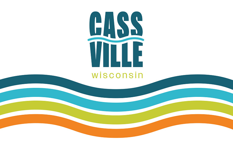
Cassville Logo and Branding
CHALLENGE
The Village of Cassville, Wisconsin knew it was time to update their branding for both their tourism organization and municipalities. This river town located next to the Mississippi River needed the new branding to communicate how Cassville wants to grow for its residents and to expand opportunities for tourists to explore. Plus, the logo must vary to identify with each of the municipal and tourism departments while staying consistent with the branding.
SOLUTION
This project started with a creative kickoff meeting with the client to learn in depth what the community needed to effectively communicate Cassville to tourists and residents. After the initial meeting, stylescapes were created to determine the vibe of the brand and serve as a starting point for the logo design.
After a thorough process of sketches and exploring logo options, the final logo design captures the heart and spirit of Cassville. The tall, stacked font represents how Cassville wants to grow and expand offerings for locals and tourists. The river is an essential part of Cassville. It's the hub of the community. The blue wavy line representing the river runs through the typeface to communicate how the river flows into the life of Cassville's community.
Bright colors, a modern but friendly logo design, and fun patterns tied the branding together to create a bold statement while making Cassville stand out in the community and beyond.


