Updating My First Design
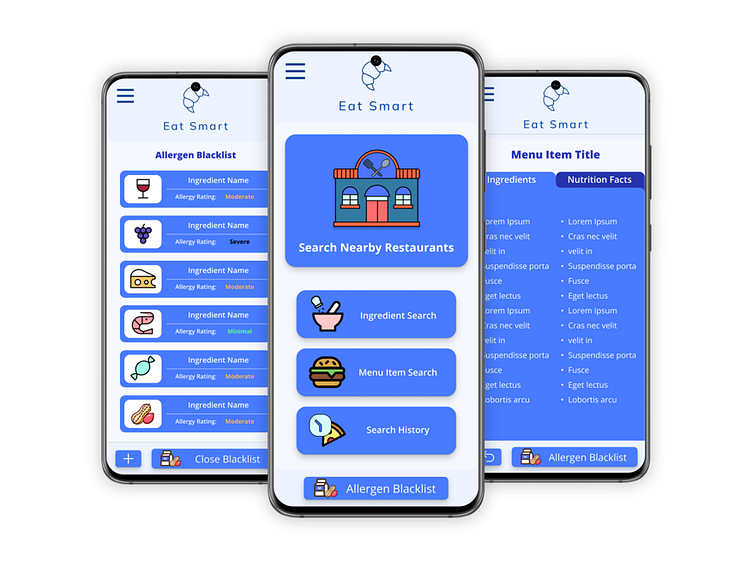
The Eat Smart App was my first UX Case Study. However when I first designed it, it had several issues such as non-WGAC-compliant color schemes and counterintuitive placement of features.
I just finished updating the entire design, and I am very proud of how it turned out!
🚀 I brought the UI up to date and condensed some overlay menus into a single, organized burger menu.
🚀 I changed the color scheme to make everything look cleaner and more modern, as well as more readable.
🚀 I updated the font on some of the text to increase readability.
🚀 I changed the transitions between pages to make it feel more like an app and less like a slideshow.
More by Myriah Webb View profile
Like


