Townes-Built™ Logo Design Presentation
There are so many parallels between the home builders and brand designers: ✔️creativity ✔️ problem-solving ✔️ attention to detail ✔️ technical skills ✔️ client collaboration ✔️ aesthetic standards
A home is more than a house.
A brand is more than a logo.
That said, logo work is foundational. Here’s a small glimpse of into the Logo Design Presentation I prepared for Townes-Built™.
Brand design is a powerful tool. ⚡️
The more Townes-Built’s characteristics are embodied in their brand design the more peace of mind the client will experience in the home building process.
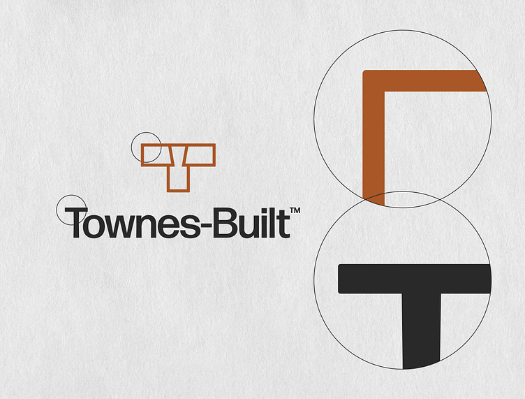
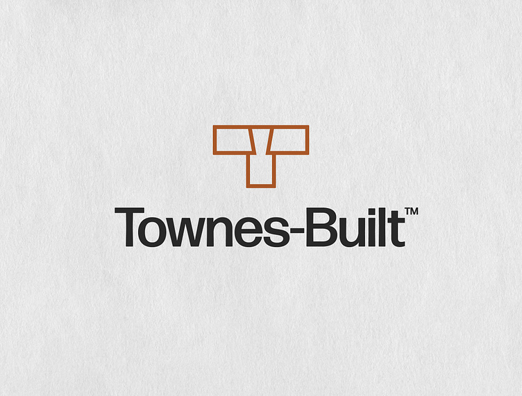
A stylish sans-serif font sets the title case logotype. (Title case means only the “T” and “B” are capitalized.) Based on metal type, this interpretation captures the rounded corners and subtle quirks that were byproducts of the printing process. It beautifully balances modernist precision with the smudgy realities of metal, ink, and paper. The tangible history of the font aligns with the construction industry as a whole as well as Townes-Built’s hands-on approach.
The exterior edges of the icon are subtly rounded and the interior corners are exact right angles to match the logotype. This extreme level of attention to detail mirrors that of the brand.