Redesiging a Social Media Advertisement Post
Before and After: A Visual Punch for Social Media
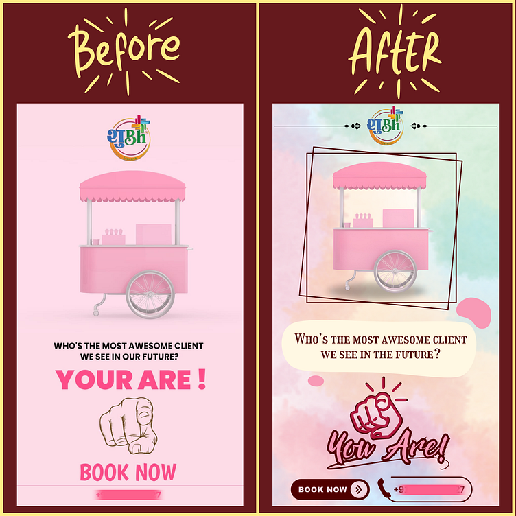
This social media post design leverages a before-and-after image comparison to showcase the transformative power of design.
Design Breakdown:
Central Image: A split image featuring a pink food cart on the left and a redesigned version on the right. The "Before" side shows a plain pink cart with minimal text. The "After" side showcases a vibrant pink cart with bold lettering, logos, and graphic elements, creating a more visually appealing and informative design.
Text Overlay: Simple and direct text ("Who's the most awesome client we see in our future? YOU ARE!") sits above the image comparison, grabbing attention and prompting user engagement. A clear call to action ("Book Now") with contact information is included below the images.
Highlighting the Redesign:
The brilliance of this design lies in its simplicity. By placing the redesigned image side-by-side with the original version, the impact of design becomes immediately clear. This approach is ideal for grabbing attention on social media platforms where users scroll quickly.
Bringing it to Life:
This design could have been created using photo editing software like Adobe Photoshop or GIMP. The before-and-after images likely required masking and cropping to achieve a clean comparison. Text elements were most likely added using the design software's text tools.
