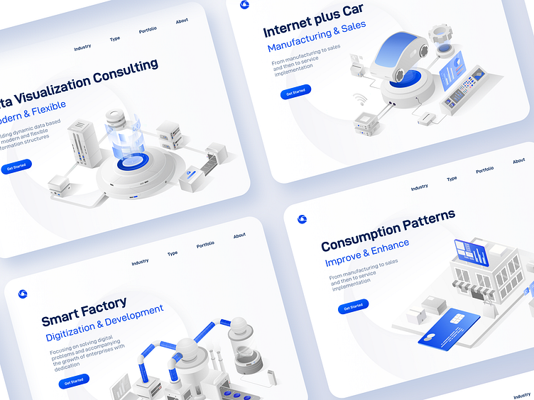
Corporate Website Image Upgrade
The upgrade of the official website this time needs to conform to the company's style. It's difficult to achieve substantial improvement just by building upon the existing foundation, or it may not align with the company's tone. Therefore, in the early stages, I had multiple meetings over meals and coffee with the project leader (mainly for work discussions).
We also tried various styles initially, including 3D, linear, and flat designs, but most of them didn't quite match the company's image, and there were uncertainties in the prototypes. This highlights the importance of thorough communication and understanding of requirements before executing the design. It's crucial not to dive into work without understanding, as it may lead to misguided efforts. Of course, there are some techniques for truly understanding requirements, but I won't delve into them here.
After thorough communication and understanding, we made some attempts and finally settled on the overall style of the website: using 2.5D illustrations, restrained color schemes, and subtle animations.
This greatly enhanced the overall quality and aimed to reduce the amount of information on the webpage. Through proper layout, we aimed to make the page clearer and more professional, thus gaining trust from customers more easily.
Finally,hope you like it~


