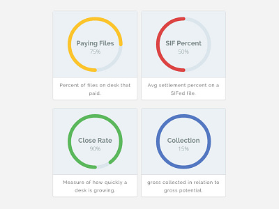
Percentage Donut Charts
These charts display at a glance how close a given statistic is to its pre-set goal. This is accomplished by using both color and the size of the filled donut chart. Depending on how close the stat is to it's goal, the color will display red, yellow, green in that order, and blue if the goal has been exceeded.
Credits:
jQuery Knob - http://anthonyterrien.com/knob/
Animate Knob - http://codepen.io/AdelDima/pen/ueKrI
More by Jacob Bennett View profile
Like
