NZ Caps - Logo Designing

Master Logo
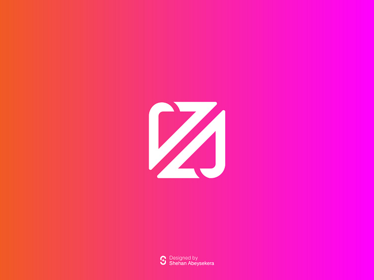
The NZ Caps logo is a vibrant testament to the dynamic innovation and technological prowess of this premier keyboard manufacturing company based in New Zealand. Crafted with meticulous attention to detail, the logo encapsulates the brand's essence with a bold and captivating design
.
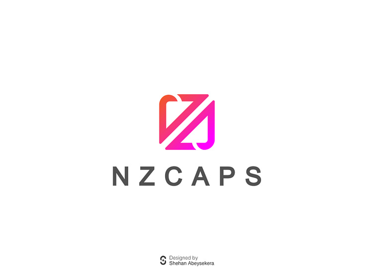
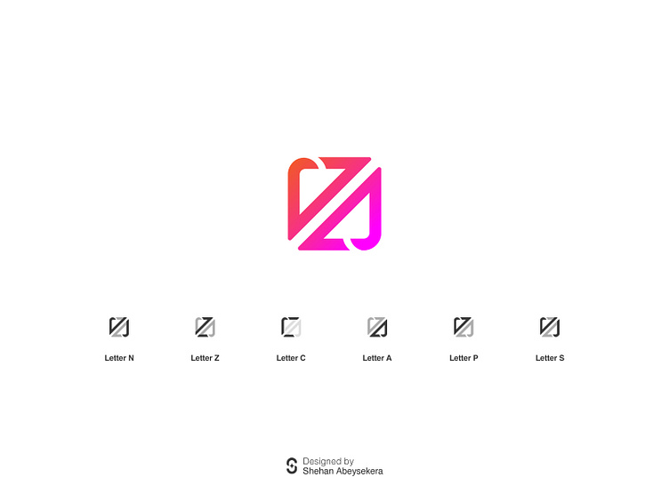
At the heart of the logo lies a meticulously designed key, ingeniously formed by combining the letters "NZ CAPS". This innovative approach not only serves as a clever nod to the brand name but also creates a visually striking centerpiece that instantly grabs attention. The integration of the brand initials into the key design symbolizes the company's commitment to innovation and excellence in every aspect of keyboard manufacturing.
The choice of colors further enhances the logo's visual impact. A vibrant combination of strong orange and pink hues is carefully selected to evoke a sense of power, energy, and creativity. Orange exudes confidence and vitality, while pink adds a touch of playfulness and modernity. Together, these colors create a harmonious and eye-catching palette that sets the NZ Caps logo apart, making it instantly recognizable and memorable.
The typography used for the company name is sleek, modern, and perfectly complements the overall design. With clean lines and balanced spacing, it ensures clarity and legibility while reinforcing the brand's image as a leader in the industry.
In summary, the NZ Caps keyboard logo is a bold representation of the brand's identity and values. It exudes innovation, power, and creativity, capturing the essence of the company's commitment to crafting top-quality keyboards that excel in both performance and aesthetics. With its striking design and vibrant colors, the logo commands attention and leaves a lasting impression, making it the perfect symbol for NZ Caps in the competitive world of keyboard manufacturing.