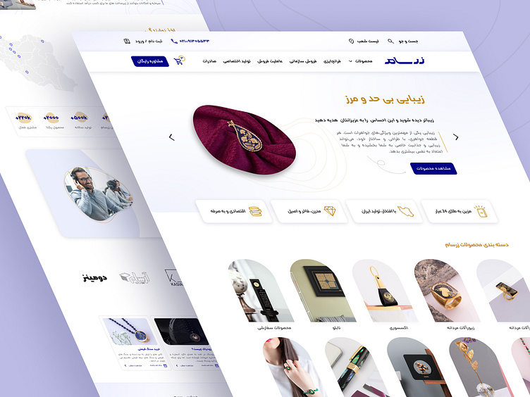
Zarsam Website - UI Project
Hello guys! 👋🏼
This is my case study from my recent project. Zarsam is one of the highly known brands that sells accessories made from gold.
Zarsam also has more than 20 branches in different cities. The project was to redesign their online website and make it responsive for all platforms.
so let me walk you through my process step by step.
But first, let's take a look at the full preview of the homepage
At first, I Choose new colors for new designs based on the brand identity.
I decided to use 2 colors, blue and gold.
To make it easy to use styles in Figma, I saved styles such as colors, fonts, grids, and ...
The whole project included 28 pages and the owner wanted all-new designs and styles for different pages.
well, that took lots of time. 😀
Let's check some of them...
Prototype
I designed components for all pages with some good interaction using the Figma prototype.
Let's check one of them that I liked a lot.
Hope you enjoy it 💛
If you have any good project in your mind, feel free to reach out. 😍
Here is my email: saeid.safapishe@gmail.com


