Pink Fusion Beauty Studio
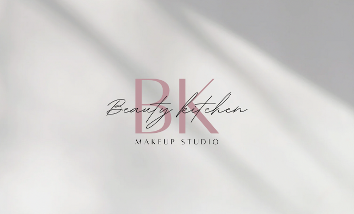
The design incorporates two prominent pink letters, "B" and "K," representing "Beauty Kitchen." These letters serve as the focal point, standing out against a background featuring a 3D vision of two shadow lines in white. Below the letters, the words "makeup studio" are elegantly placed, completing the brand identity. The pink color scheme exudes vibrancy and femininity, while the 3D elements add depth and sophistication to the overall logo. This combination creates a visually appealing and memorable representation of the brand.
