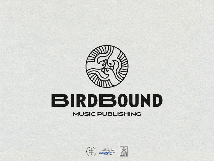
Birdbound Logo Design
Logo design for a new music publishing business out of Hamburg
The client envisioned a modern logo that comes off both as friendly and trustworthy.
🐦 I created an icon based around 3 birds, as the company is founded by 3 close friends.
It’s paired with a unique geometric sans serif inspired by the 30s and the Art Deco movement.
🏭 For the colors, we decided on black and white to give the brand a mature, industrial feel.
Went a bit more minimal than usual with this logo system.
💬 Let me know how you feel about it below!
More by Coric Design View profile
Services by Coric Design
Like
