Nooxin blade brand identity
About Nooxin Blade:
Nooxin Blade is more than just a brand; it's a celebration of the art of culinary craftsmanship. With a passion for precision and a dedication to quality, we craft chef knives that empower chefs and culinary enthusiasts to elevate their culinary creations to new heights.
Brand Identity:
At Nooxin Blade, our brand identity is a reflection of our commitment to excellence and innovation in the culinary world.
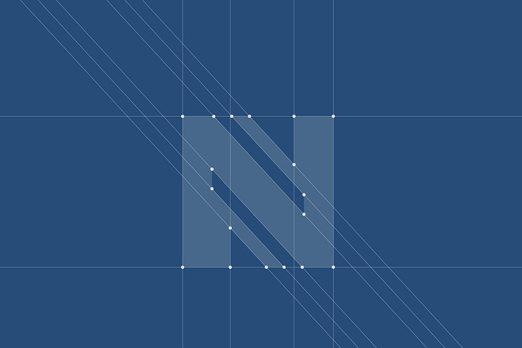
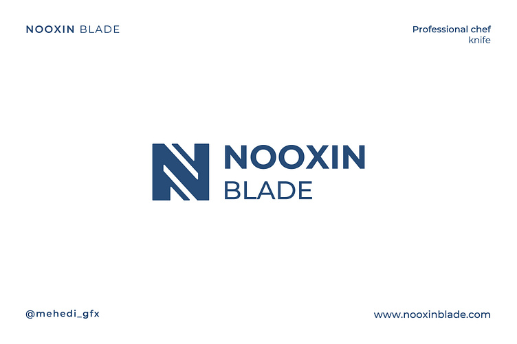
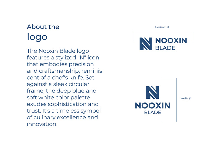
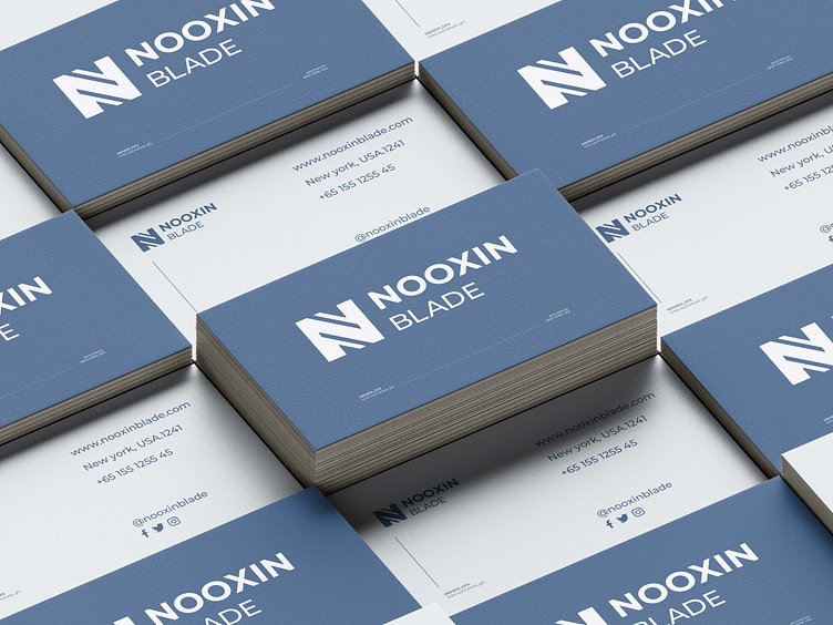
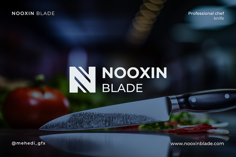
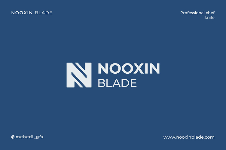
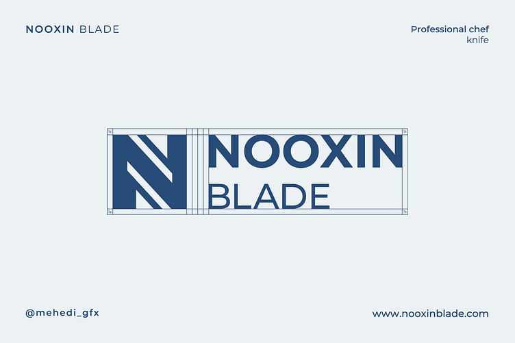
Logo Design: Our logo features a stylized "N" icon, reminiscent of a chef's knife, symbolizing precision and craftsmanship. Set against a sleek circular frame, the deep blue and soft white color palette exudes sophistication and trust.
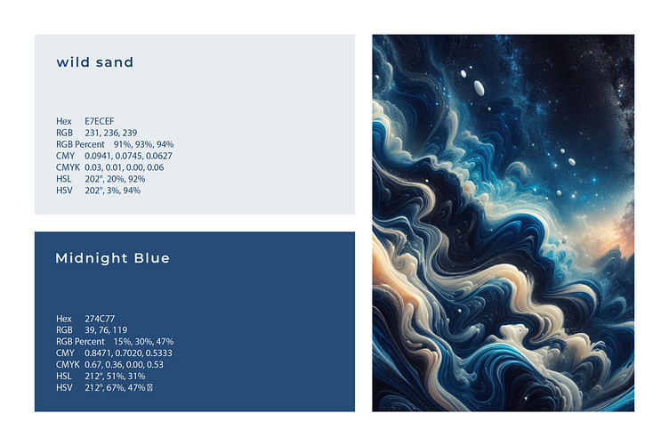
Color Palette: #274c77: Deep blue symbolizes reliability and professionalism. #e7ecef: Soft white evokes purity and finesse.
Typography: We use the Montserrat font to communicate our brand's identity. Its contemporary yet professional style ensures clear communication across all platforms.
Icon: The stylized "N" icon in our logo represents precision and innovation, serving as a timeless symbol of culinary excellence.
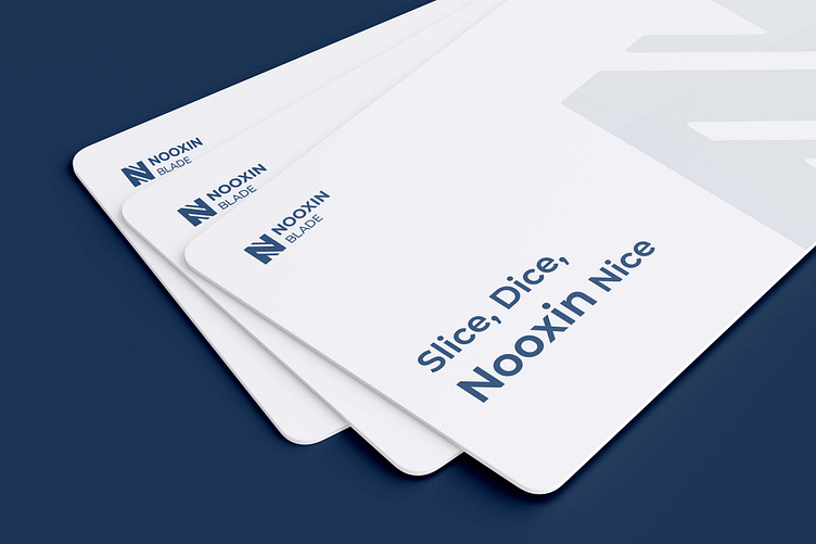
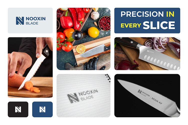
Slogan: "Where Precision Meets Passion"
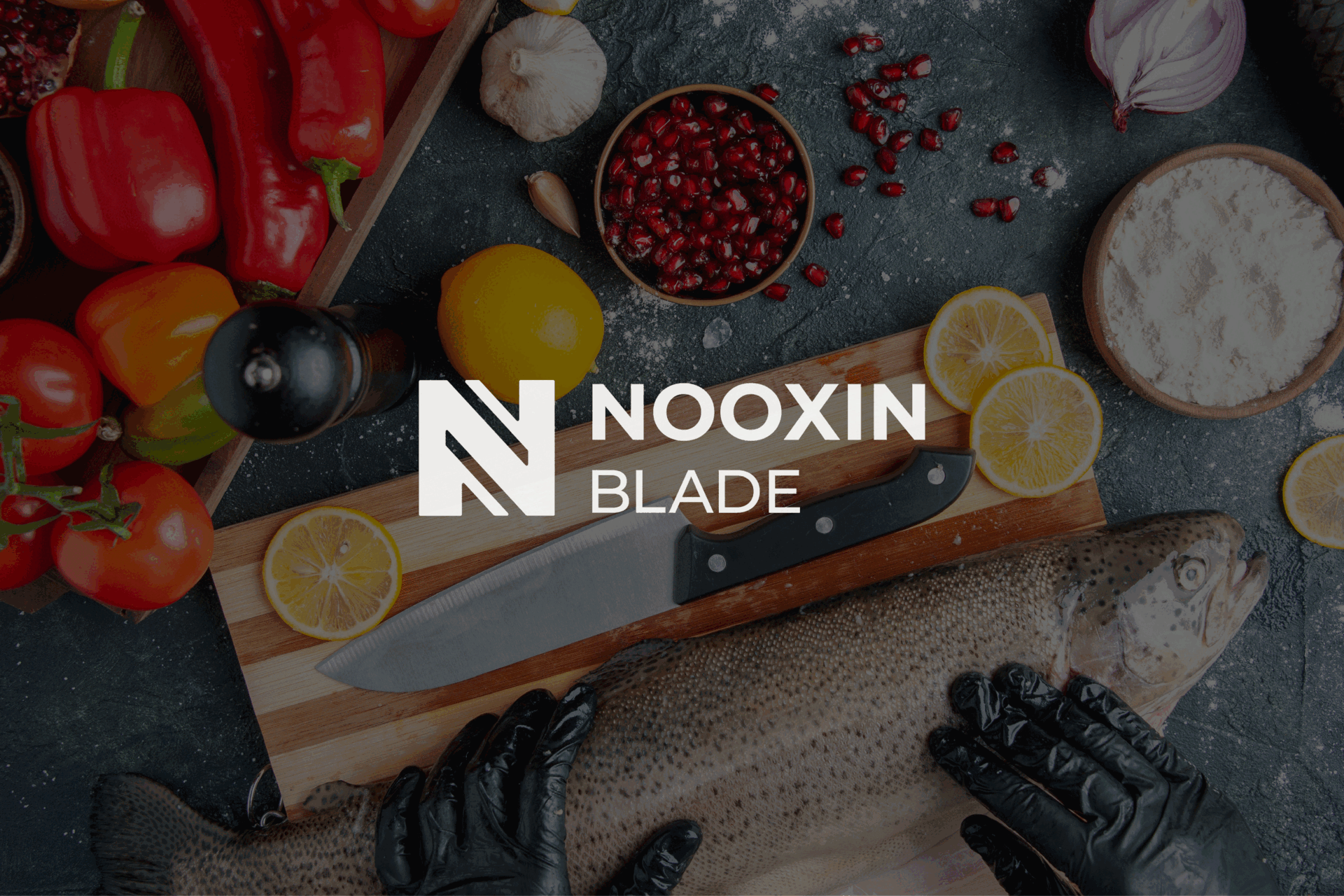
Description: Step into the world of Nooxin Blade, where culinary artistry meets cutting-edge craftsmanship. Our brand is a testament to the art of culinary excellence, offering meticulously crafted chef knives that empower chefs and home cooks to unleash their creativity in the kitchen.
With a commitment to quality and innovation, Nooxin Blade is more than just a brand – it's a journey of culinary discovery. Experience the difference that precision, passion, and craftsmanship can make in every dish you create with Nooxin Blade.