Visual identity concept (4/4)
Concept of visual identity for my bachelors degree final project.
About concept
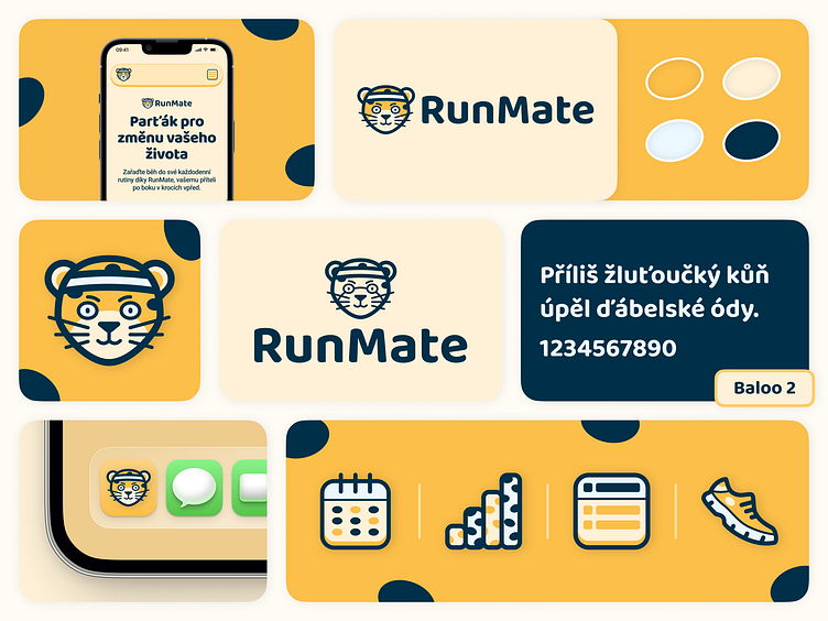
RunMate is your mate and partner for big changes in life and health support via mobile app focused on forming a habit of frequent running.
The name of the app is combination of 2 words: Run and Mate. Word “Run” clearly shows app's category (fitness) and its main goal, which is greatest possible assistence to users during their runs. Second part, word “Mate”, gives the mobile app a friendly touch by giving user a friend with whom he can change change his habits and establish regular running routine. The name is based on the psychological thesis that everything goes better with a buddy by your side!
The partner of every user is the app's mascot - a cheetah, the animal linked maninly with running. Entire visual identity is designed in a playful and cartoonish style – starting with the mascot and ending with the primary font.
The app's color palette is based on orange, that is supported by blue used as neutral color. Orange is a color typical not only of the cheetah, but also gives people a feeling of energy, happiness and is one of the colors symbolizing vitality. The blue color balances the playfulness of the app's visual identity and gives it a touch of credibility, which is key aspect in choosing a life-changing partner.
