Visual identity concept (3/4)
Concept of visual identity for my bachelors degree final project.
About concept
Runney is a mobile app that acompanies you on the way to creating the habit of regular running.
The name is a compound of 2 words - Run and Journey. Word “Run” clearly shows app's category (fitness) and its main goal, which is greatest possible assistence to users during their runs. Second part, word “Journey”, symbols a long journey to a better life which can be guided by Runney.
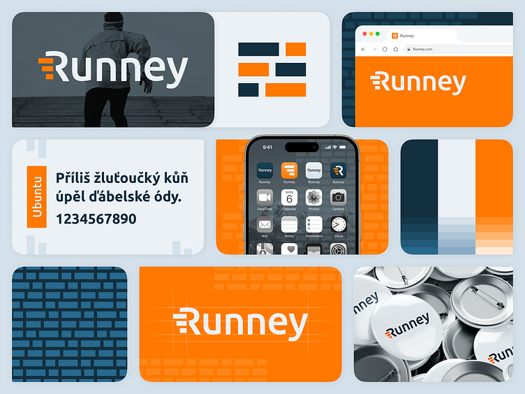
The app's logo consists of 2 elemenets - Logotype and symbol. The symbol represents the lines of air that form behind a running person and is further used in the primary shape of the visual identity, which is a square brick wall expressing the progressive (laying brick by brick) creation of solid roots (brick wall) during the routine's formation.
Runney's color palette is based on the harmony of 3 main color - Orange, Blue nad White. Orange is also a color of energy and joy, the basic emotions of regular running. Those are supported by calm a credibility, that are brought by the blue color.
