Visual identity concept (2/4)
Concept of visual identity for my bachelors degree final project.
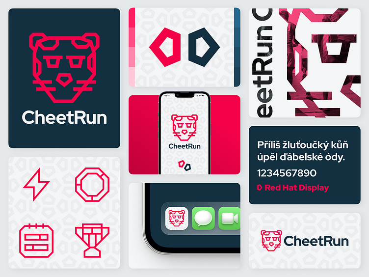
About concept
CheetRun is a mobile app that helps you “cheat” in forming a healthy habit in your life.
The name of the app is combination of 2 words: Cheet and Run. Word “Run” clearly shows app's category (fitness) and its main goal, which is greatest possible assistence to users during their runs. First word, “Cheet”, is an abbreviated name of an animal that is something like a symbol to speed and running - a cheetah. The cheetah in the name of the application doesn't only refer to running, but also to the speed with which CheetRun will help you form healthy habit of running.
A significant element of the visual identity is the monochrome cheetah mascot in a minimalistic sharp style that is heavily connected with mobile app's primary font. The primary shape of the app's visual identity is mascot's nose, which when used in the pattern resembles the fur of this animal.
Primary color of CheetRun's visual identity is red, he color of passion and love, emotions that run must evoke in every regular runner. According to the 60/30/10 color harmony rule, red is used as an accent color in 10% frequency.
