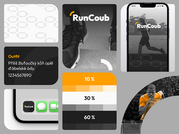
Visual identity concept (1/4)
Concept of visual identity for my bachelors degree final project.
About concept
RunCoub is a habit-forming mobile app focused on integration of running into user's daily routine.
The name of the app is combination of 2 words: Run and Coub. Word “Run” clearly shows app's category (fitness) and its main goal, which is greatest possible assistence to users during their runs. Second part, word “Coub”, represents the symbol of sportsmanship of the Olympic Games by shorting surname of its founder, Pierre de Coubertin.
The most essential element of RunCoub's visual identity is a symbol used in logo and has 2 meanings - Running trail and road from Athens to Marathon, which, according to legend, was run by the ancient Greek Pheidippides. Secondary visual identity element is a circle made of 4 essential/primary elements that symbolizes milestone on the way to the goal of better life.
RunCoub's primary color is orange which is used in 10 % according to interior design rule called 60/30/10. Orange is also a color of energy, joy and a symbol of vitality. These effects are amplified by shades of yellow and its sense of hope.
