Jet Deliveries - Brand Identity Design
Jet Deliveries Logo Concept
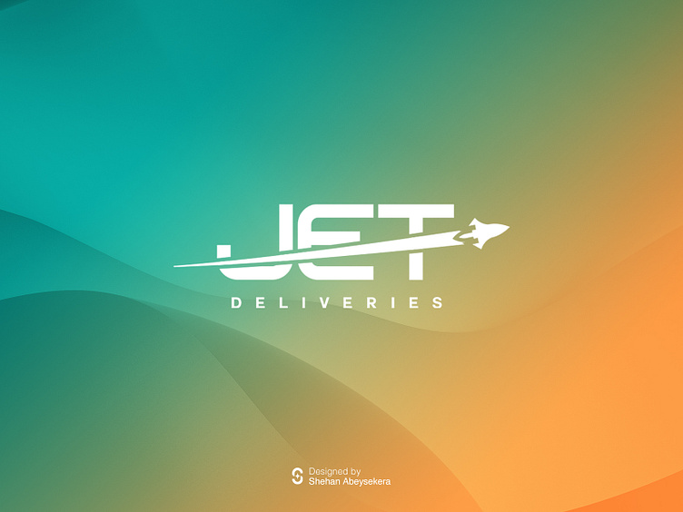
The incorporation of the name "JET" into the logo serves as a powerful visual representation of their commitment to fast deliveries. The choice of a typeface that conveys speed further reinforces this message, ensuring that the concept is immediately recognizable and memorable to your audience.
Colour psychology plays a vital role in conveying the essence of their service. The variant of green and orange colours is a strategic choice. Green, often associated with freshness and health, communicates the quality and freshness of the food they deliver. It instils confidence in its customers that they are receiving wholesome and delicious meals. On the other hand, orange exudes energy, enthusiasm, and warmth, reflecting the excitement and satisfaction of their prompt delivery service.
The inclusion of a jet travelling at high speed within the logo is a stroke of genius. This imagery not only reinforces the idea of rapid delivery but also adds a dynamic and visually engaging element to their brand identity. The sleek and streamlined design of the jet symbolizes efficiency and professionalism, further enhancing the perception of the brand as a reliable and speedy delivery service provider.
Overall, the logo concept effectively communicates the brand's key attributes and promises to its target audience. It creates a lasting impression, instilling trust and confidence in Jet Deliveries as the go-to choice for fast and efficient food delivery services in Sri Lanka.


