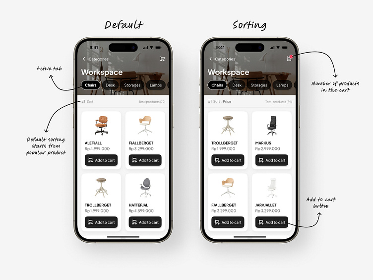
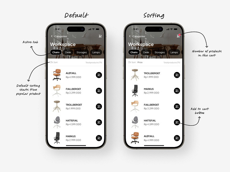
Furniture App - Categories Screen
This is actually a challenge with various deadlines, but the context remains the same.
The challenge is to create categories screen.
The first one is using List, and the second is using Card.
1 - Product List
When using a List, you can see more products and the Add to Cart button usually is on the right.

2 - Product Card
But when using a Card, you see fewer products but with a better product view and a bigger Add to Cart button.
So, which one do you prefer?
For me, I prefer the first option. Using a list helps me focus on the products and makes it easier to scan them one by one.

Let's work 🤝
I would love to design your apps too!
Just email me at oliviaanggunpermatasari@gmail.com
You can also follow my Instagram @oliviaangper.
Thanks, have a great day 🥰